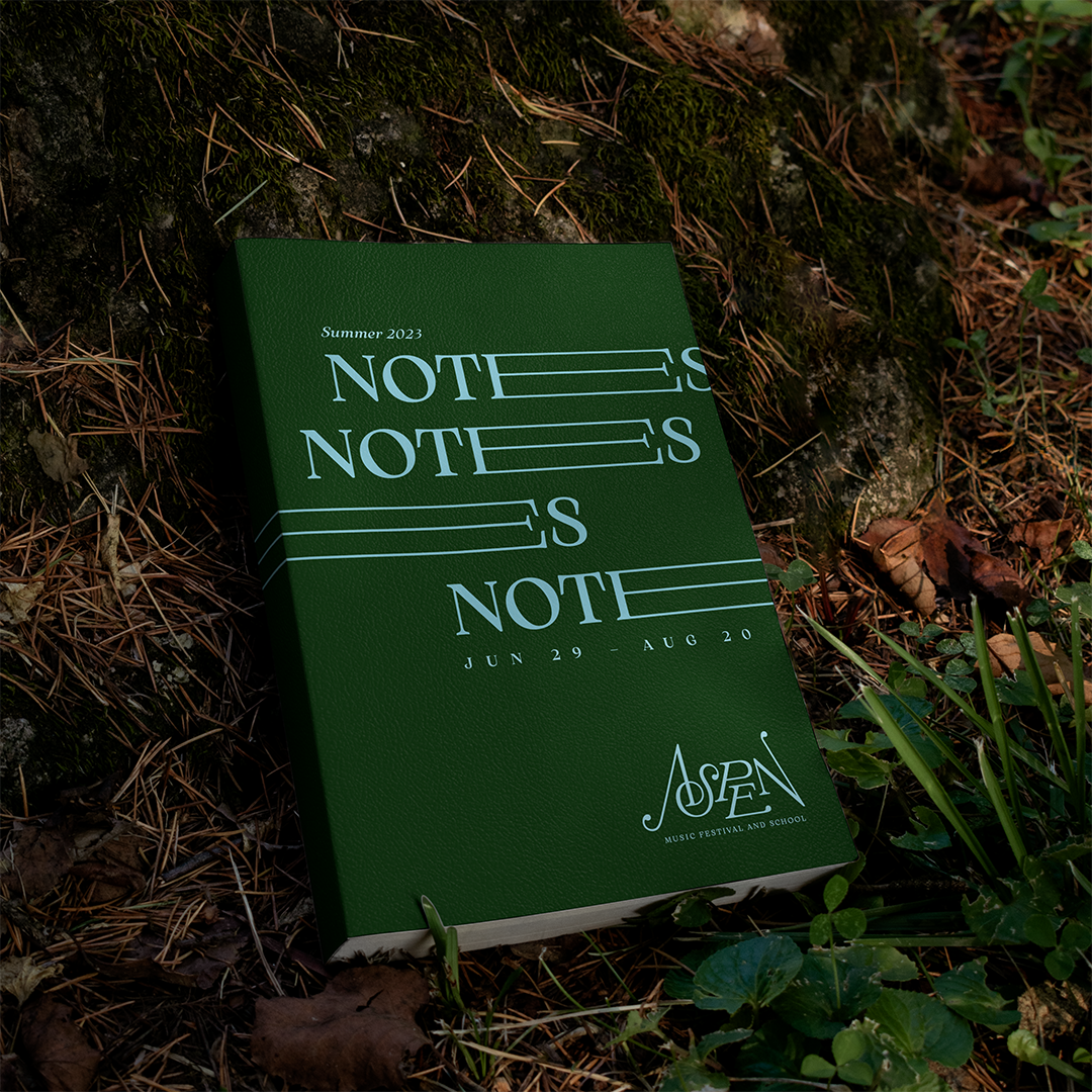
Summer 2023
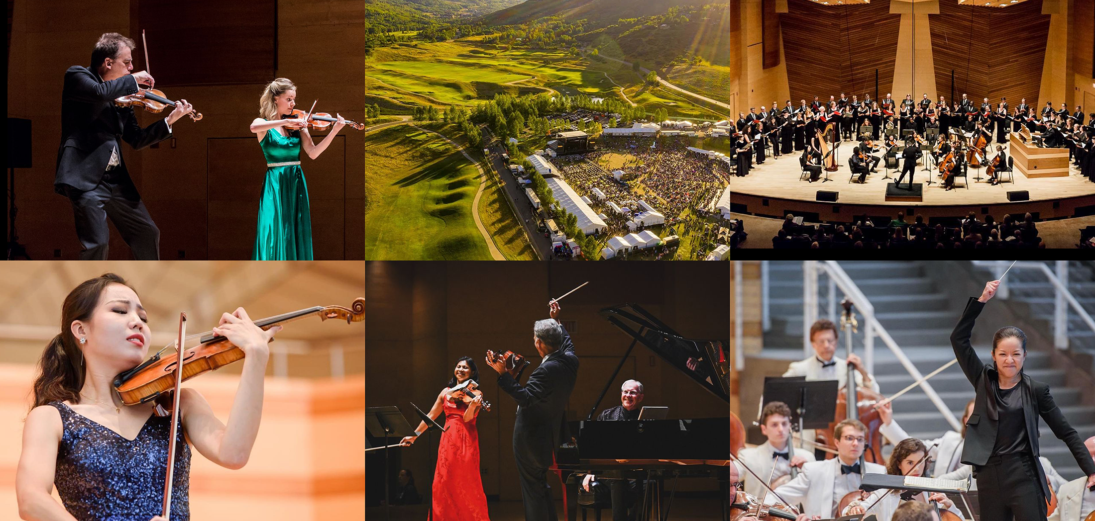
Aspen Music Festival and School
Known for its first-rate classical music concerts and prestigious music education programs since 1949, the Aspen Music Festival and School annually assembles promising young talent with international stars on the grand stage that is the Rocky Mountains.
The resulting visual identity is informed by the lush mountainous landscape, sheet music typography, and movement quality of the orchestra itself to create a generative music-responsive wordmark and accompanying identity.
The festival
Aspen Music Festival and School is a prestigious annual classical music institution taking place every summer in the Rocky Mountains of Aspen, Colorado.
Founded in 1949, the festival has been a preeminent destination for musicians and audience members from around the globe for world-class performances and programming.
More than just a festival, the institution has provided decades of renowned educational programs for the stars of tomorrow to learn from the stars of today.
These artists, educators, students, and audience members all come together to celebrate classical music on the grandest stage of all — the Rocky Mountains.
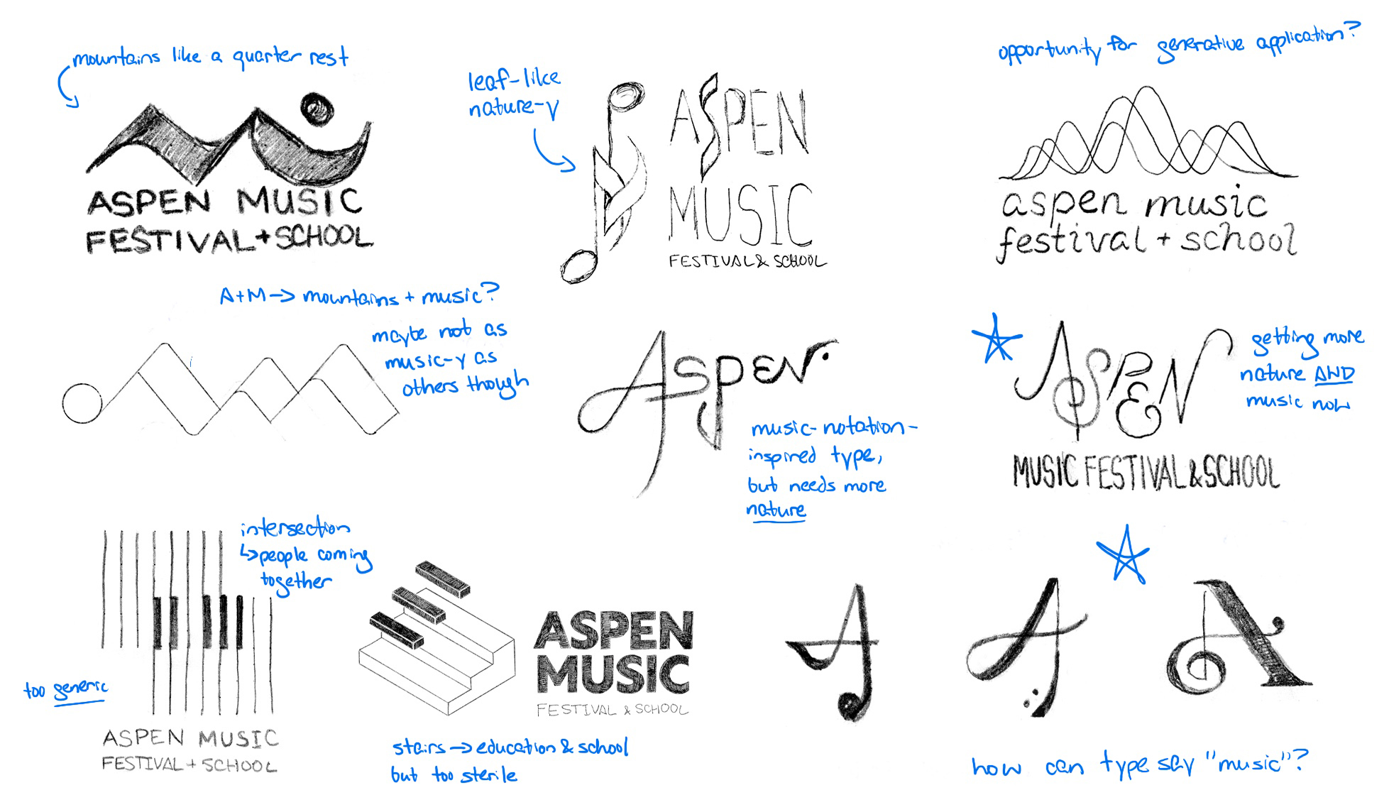
Initial logo ideation
Initial sketches explored references to classical music notation, nature, community, and education.
Lettering iterations
Narrowing in on custom hand-lettering, levels of complexity and expression were explored.
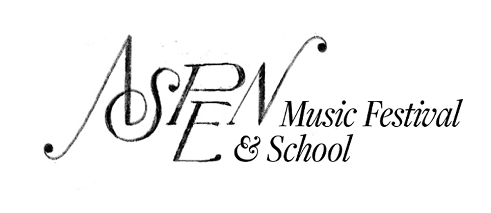
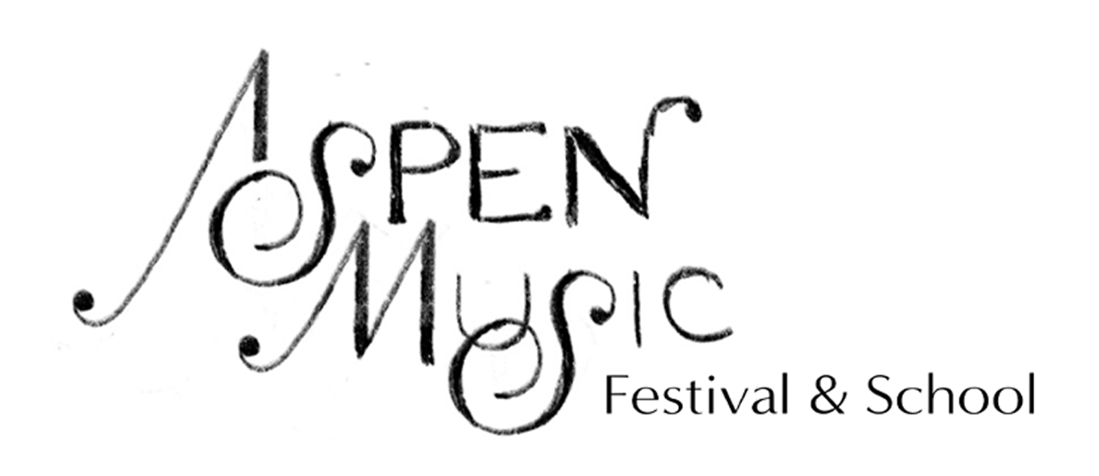
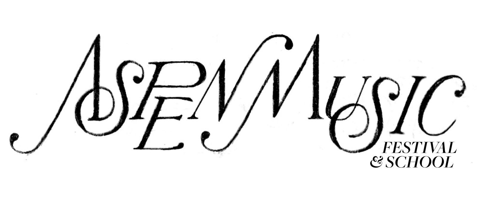
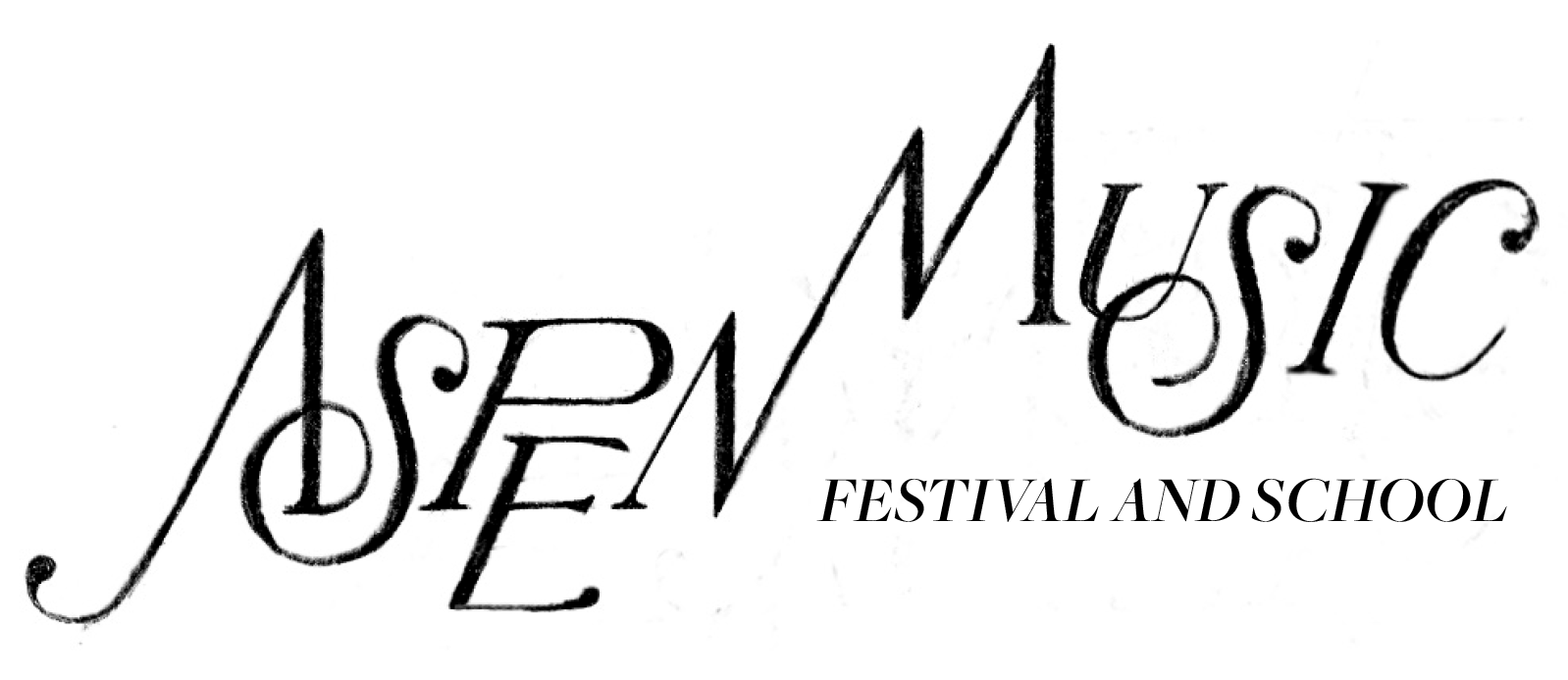
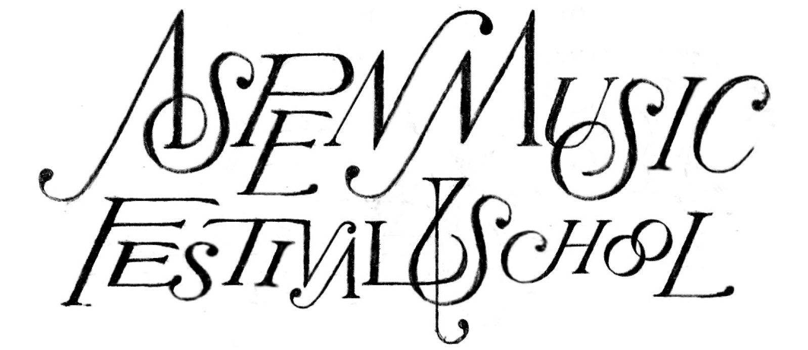
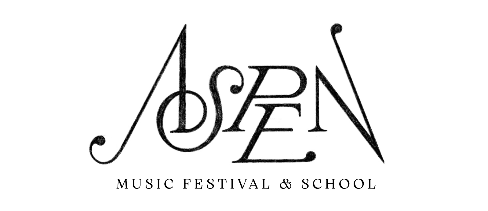
Influences from music notation and nature
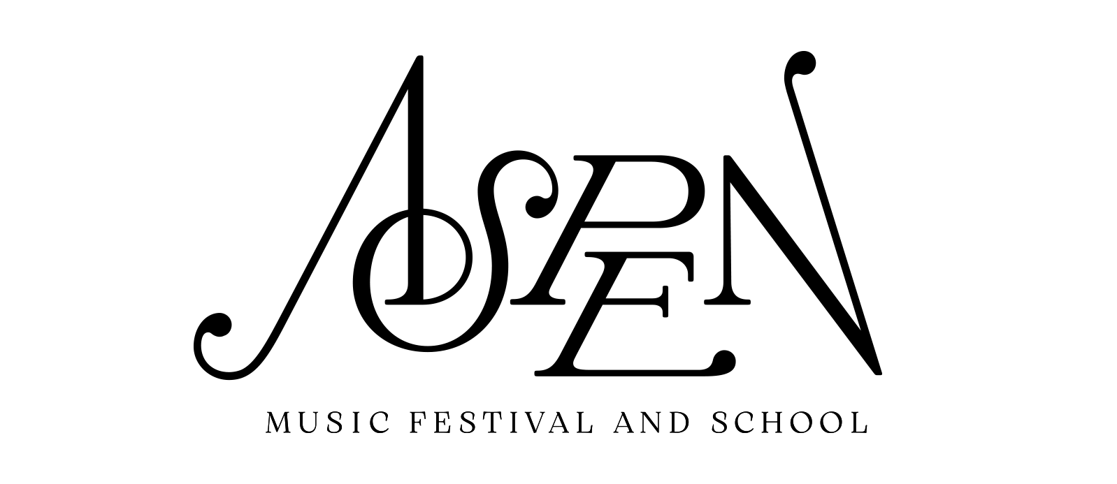
The final direction for the logo takes heavy inspiration from music notation.
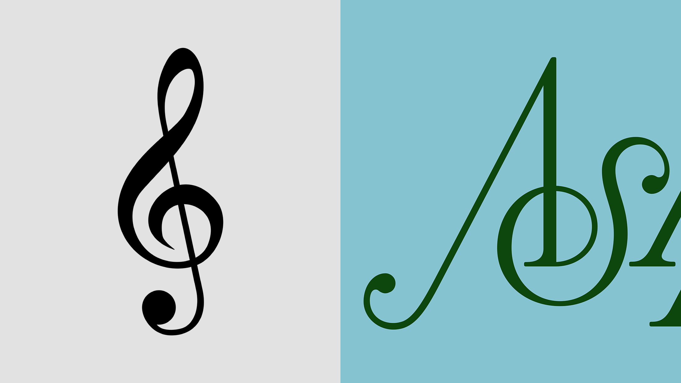
With letters that shift up and down in baseline like music notes on a staff.

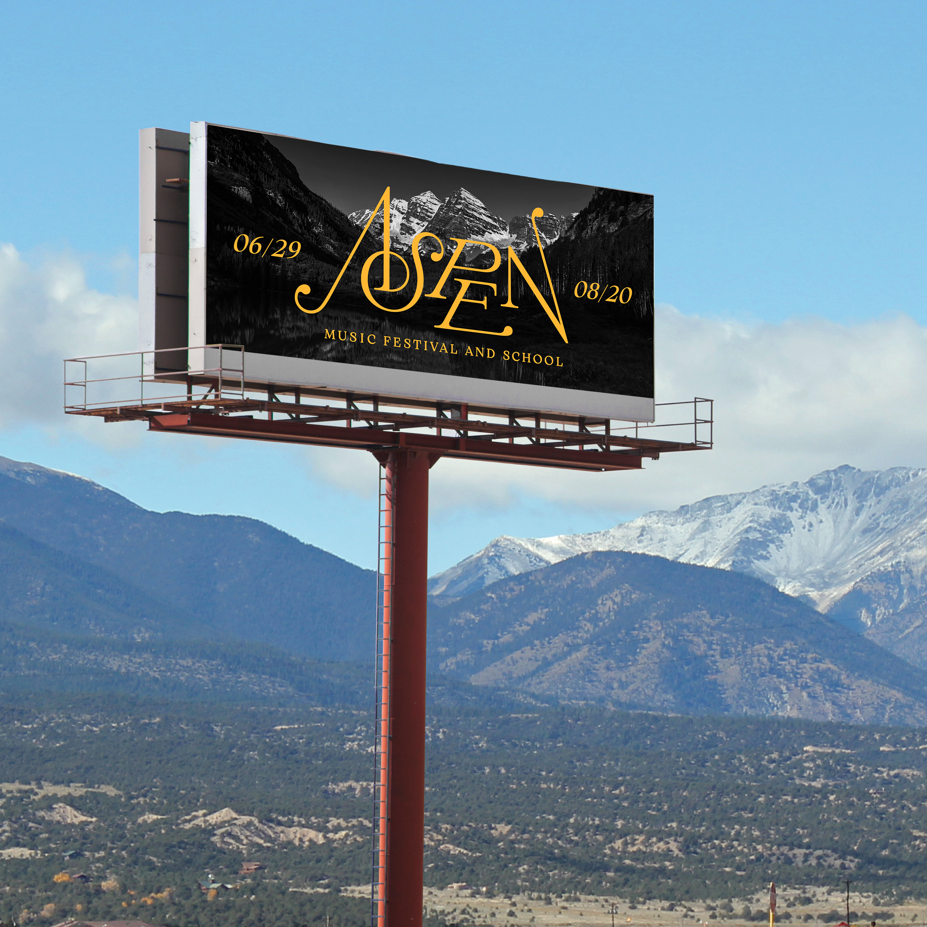
And the overall silhouette originating from the mountains themselves.
Typography
Arsenica is the identity's primary typeface. With its serious tone of voice and fluid italics, it reflects the typography of sheet music, but with an organic quality of nature.
Museo Sans is the identity's secondry typeface. It reads well at small sizes with open counters, and shares a similar skeleton to Arsenica with round circular curves.

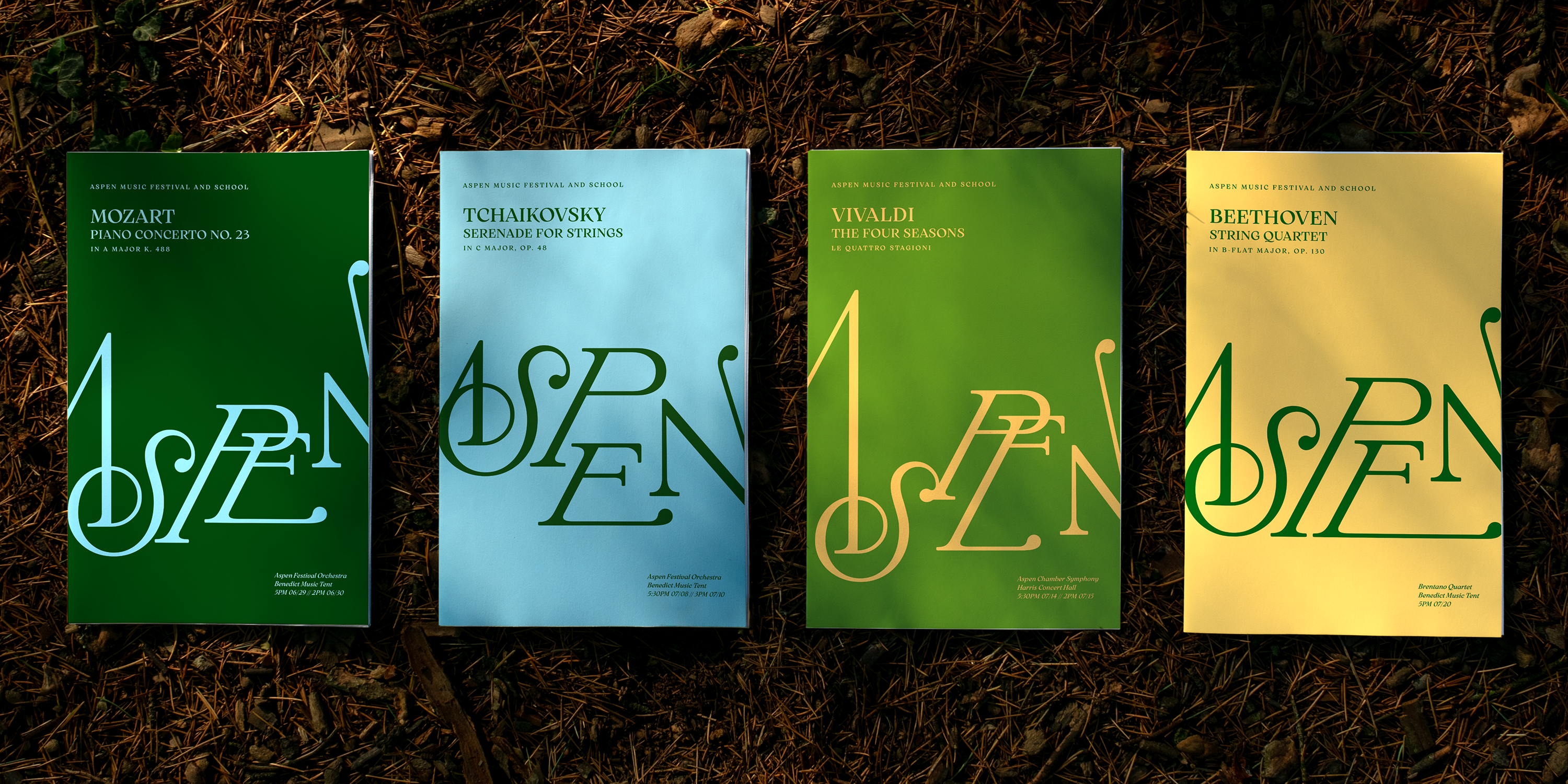
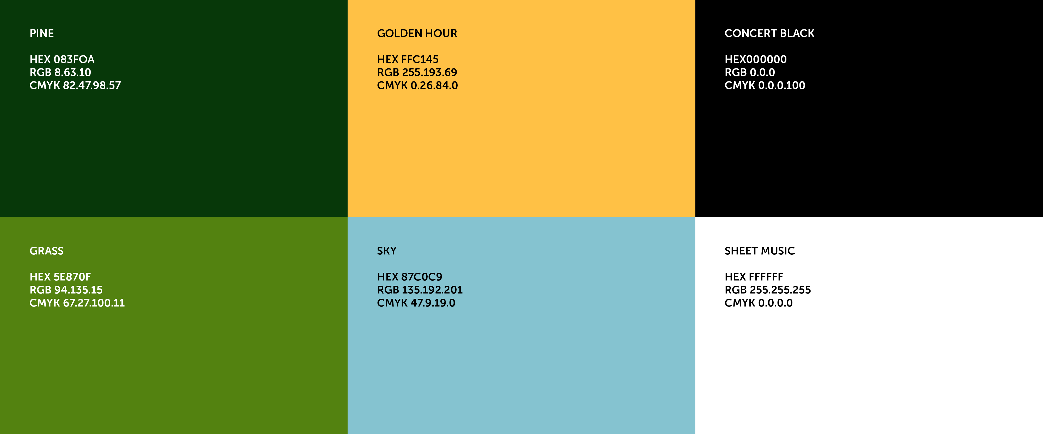
Color
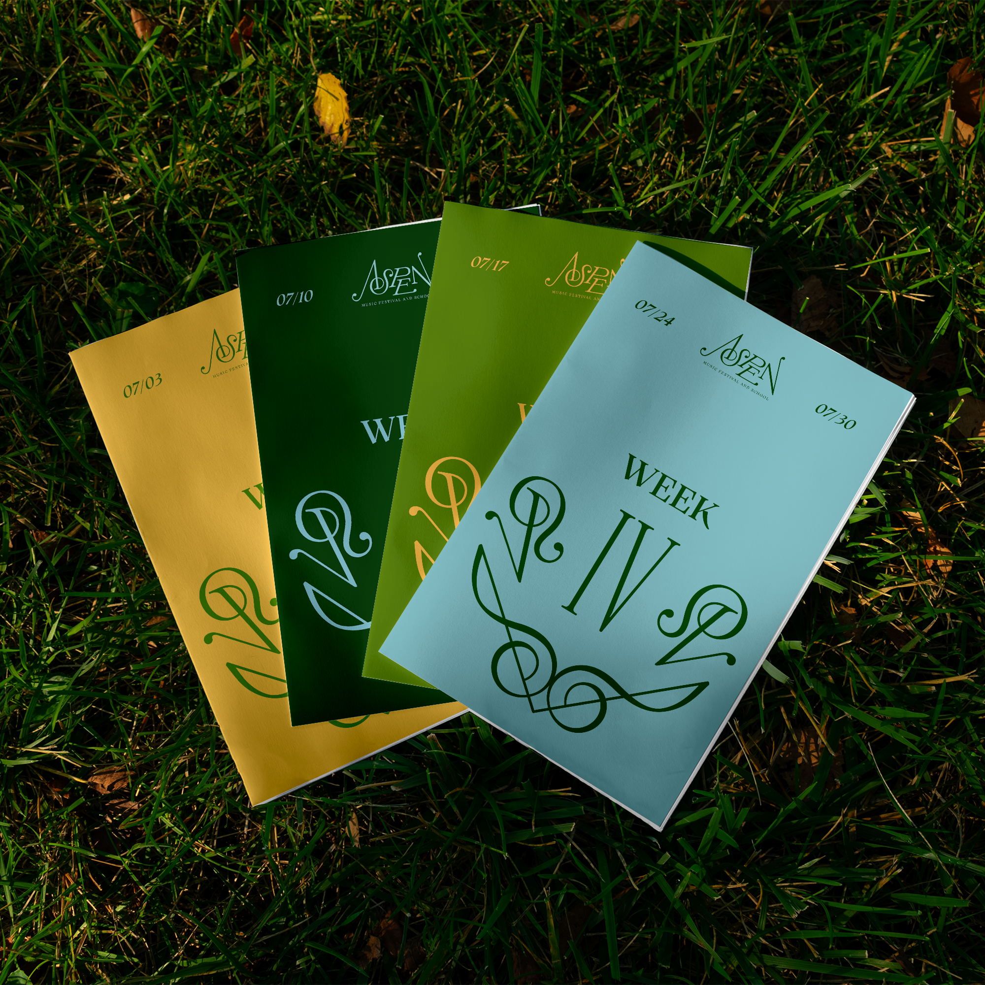
The colors were chosen for their links to summer in Aspen with lush forests, warm sunshine, and wide open skies. The colors also support a serious tone of voice and air of prestige, while still expressing the vibrancy of music.
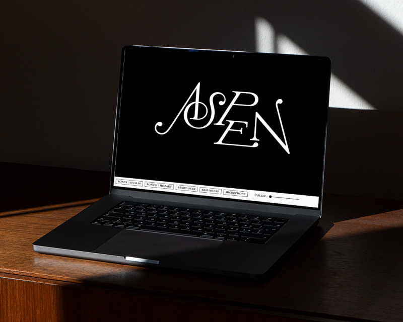
Programming a music-responsive logo
Built using a combination of p5.js and variable font technology, the wordmark is music-reactive. Interpolating through variations of baseline and distortion, the letterforms of the wordmark respond to both volume and pitch of live audio input. As they travel up and down, the letterforms create different mountainous landscapes.
The sound directly informs the movement of the logo without artificial easing or smoothing of motion to most accurately represent the imperfect raw expression of music with vibrato and all. The result allows the logo to behave like different instruments accordingly, sometimes appearing like the bows of the strings section, and sometimes like the struck keys of a piano.
Final Identity
Aspen Music Festival and School's new identity communicates both the inspirational energy of the event and lush natural environment through its vibrant color palette; through the generative wordmark creating rolling mountains as it’s informed by music; and through dynamic typography that both references the visuals of sheet music and feeling of rhythm.