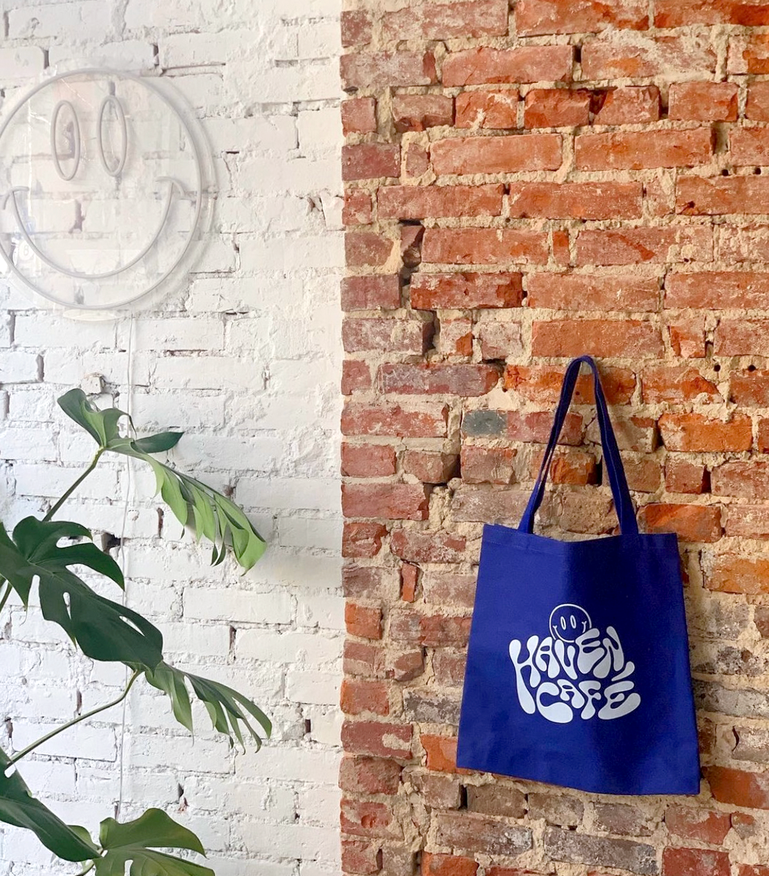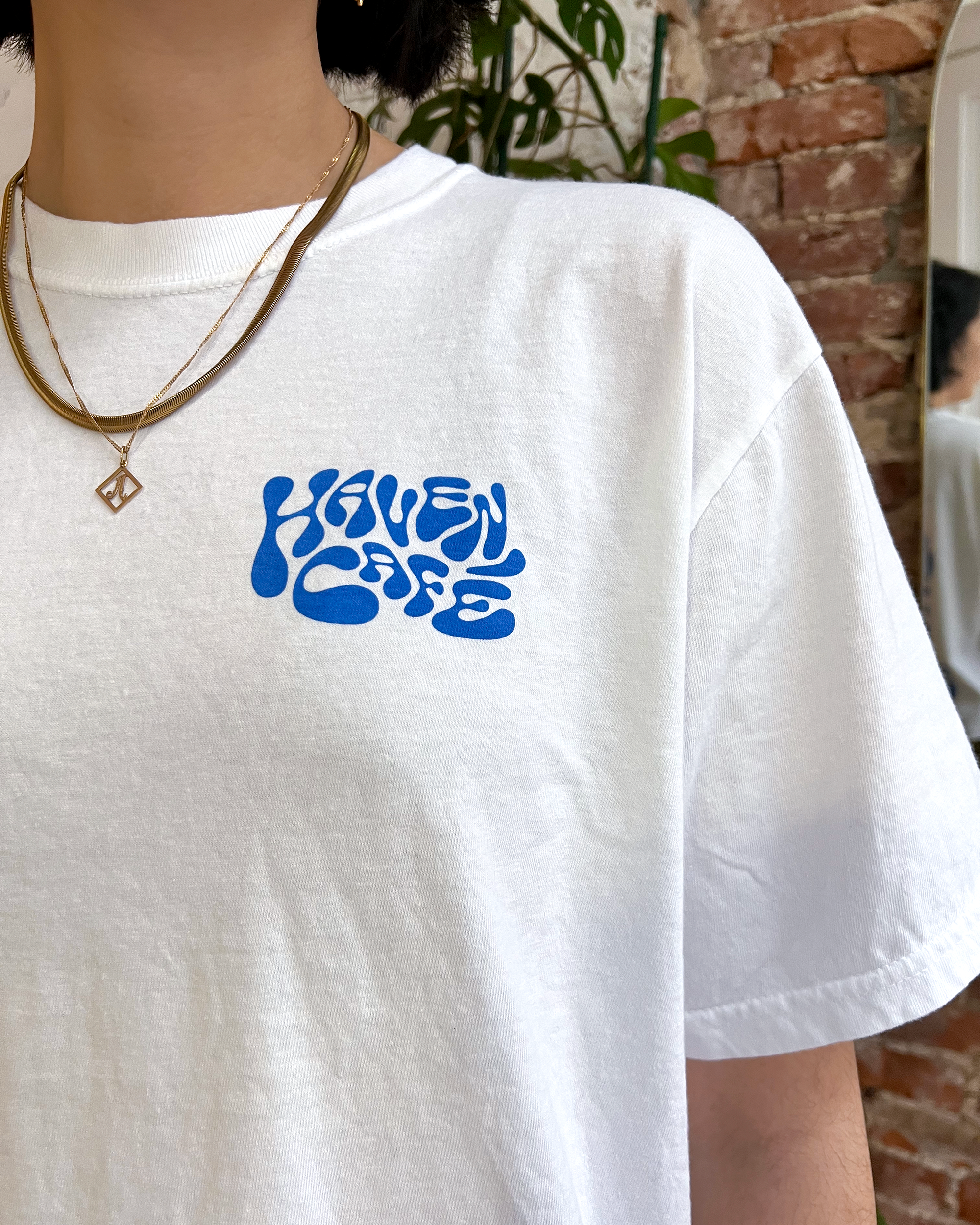
Haven Café Merchandise
FREELANCE WORK
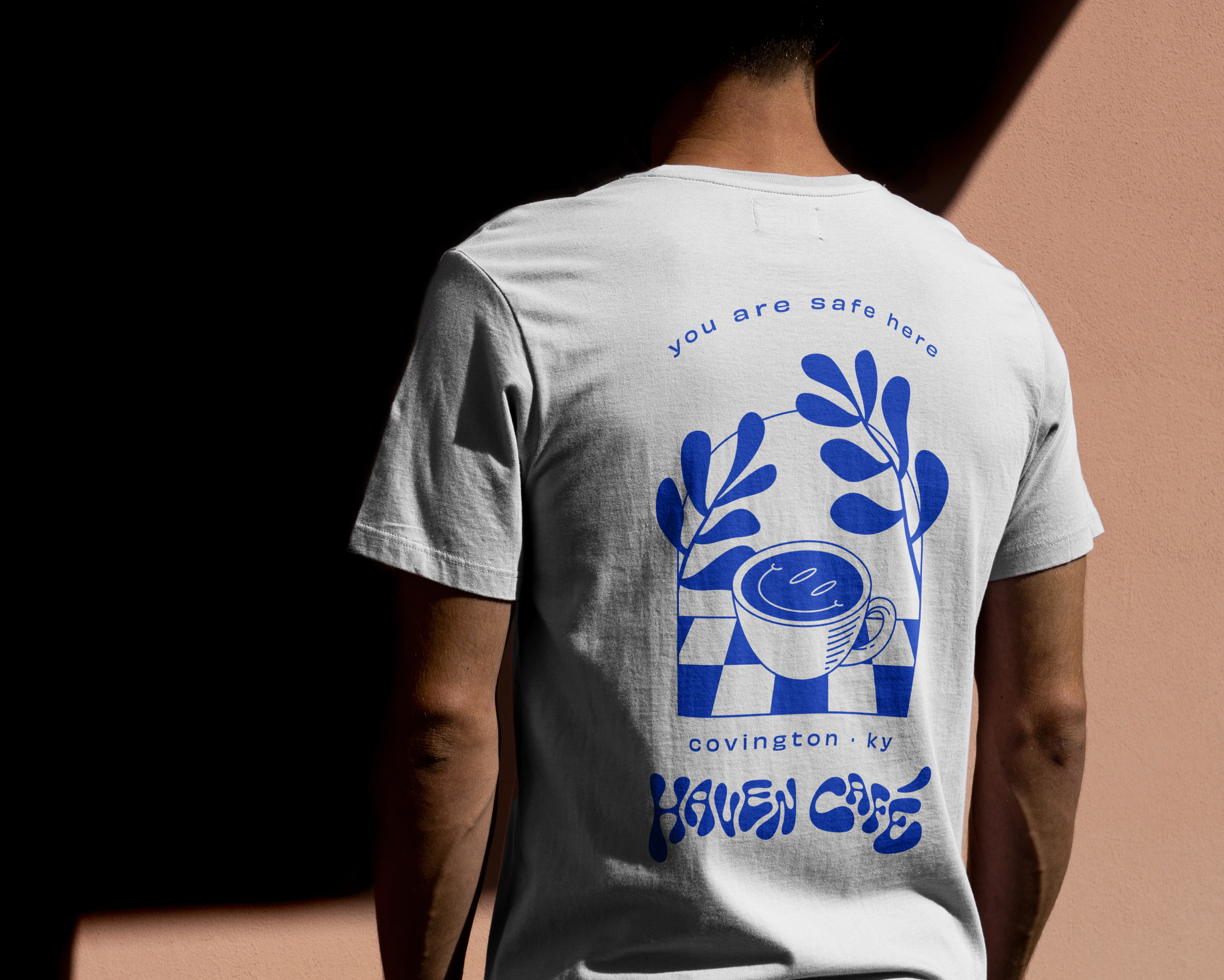
Haven Café takes the trendy, metropolitan coffee shop experience and brings it to Covington, Kentucky. The independently-owned shop has been serving specialty coffee, artisanal pastries, and locally sourced small bites since August 2020. As a both a barista and designer at Haven, I was commissioned to create the café's first t-shirt, as well as an accompanying tote bag.
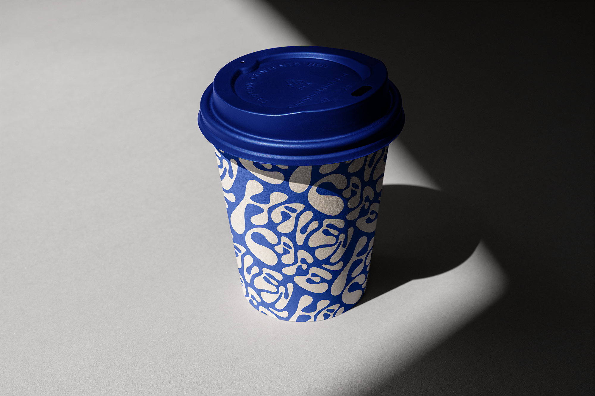
I wanted to capture the personality of the shop while appealing to its young clientele, with a fun youthful cartoonish look that still reflects the “safe haven” of the café’s environment. In addition to the t-shirt, I decided to imagine what a an expanded line of merchandise and packaging would look like, along with re-designed coffee cups and pastry boxes.
I wanted to capture the personality of the shop while appealing to its young clientele, with a fun youthful cartoonish look that still reflects the “safe haven” of the café’s environment. In addition to the t-shirt, I decided to imagine what a an expanded line of merchandise and packaging would look like, along with re-designed coffee cups and pastry boxes.



Capturing the Haven look

Images from @havencafecov on Instagram
A single-color design and sans-serif typeface
Haven strives to create an environment of safe haven for its employees and customers alike. To reflect this, I used an extended sans-serif typeface with elegant wide curves and loose tracking, creating a light airy feel.

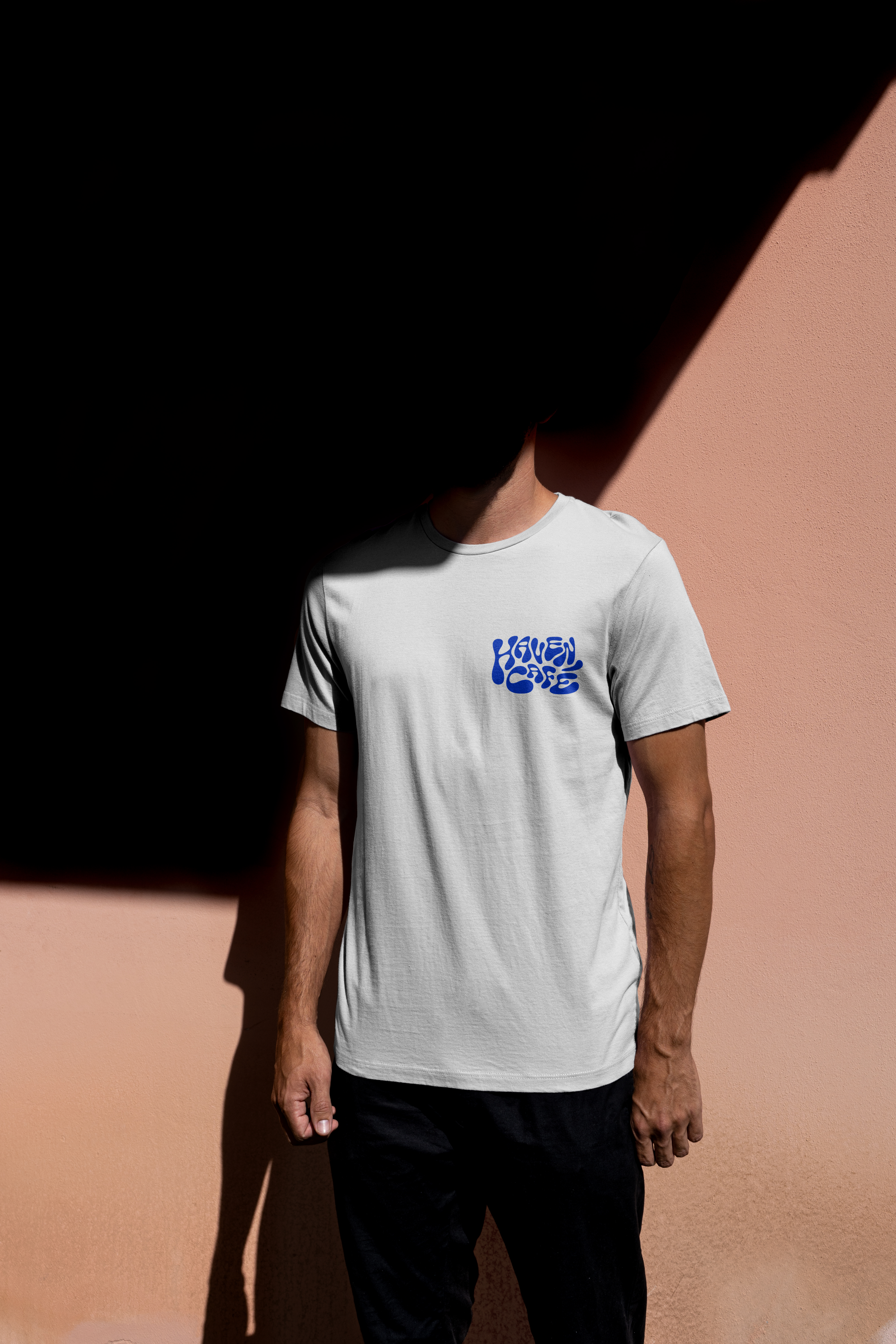
Liquid Lettering
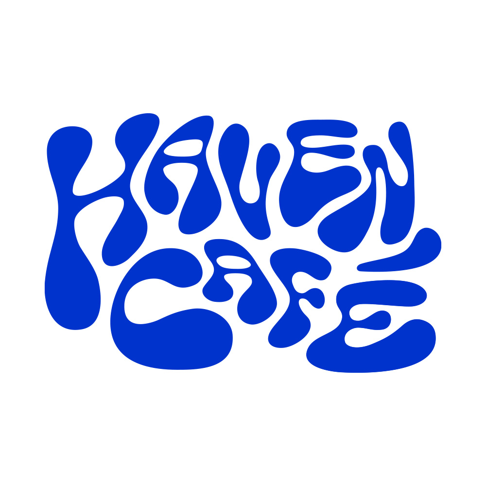
I wanted to reflect this in the custom lettering through fluid organic forms and influence from the psychedelic lettering of the 1960s. I manipulated letterforms to exaggerate the melty psychedelic qualities, create more irregularity, and create letters that flow into one another like liquid.
The final t-shirt


Extending the design to further applications


