Summer 2024
Crosley Display Face
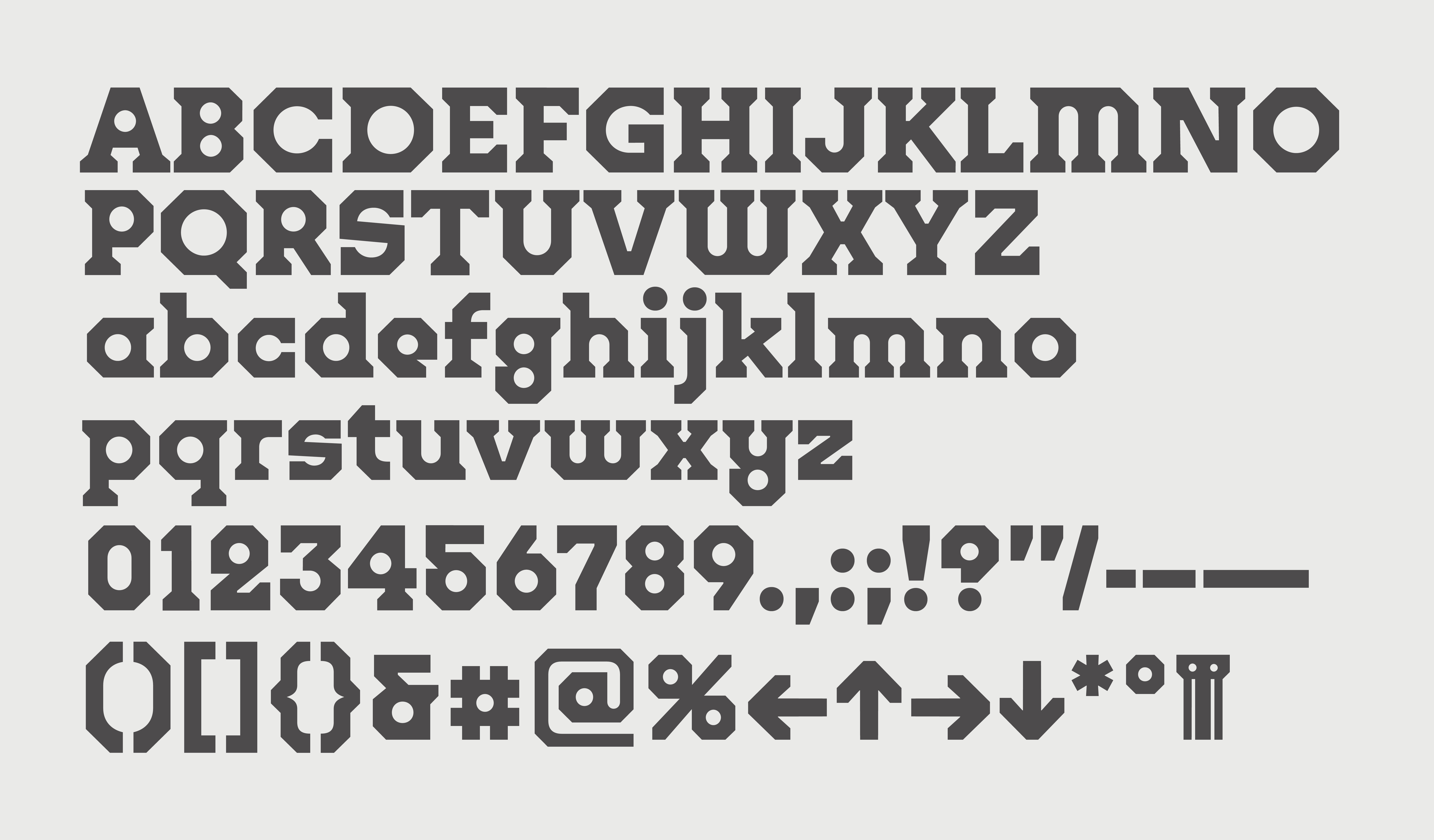
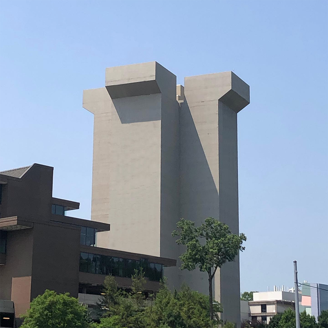
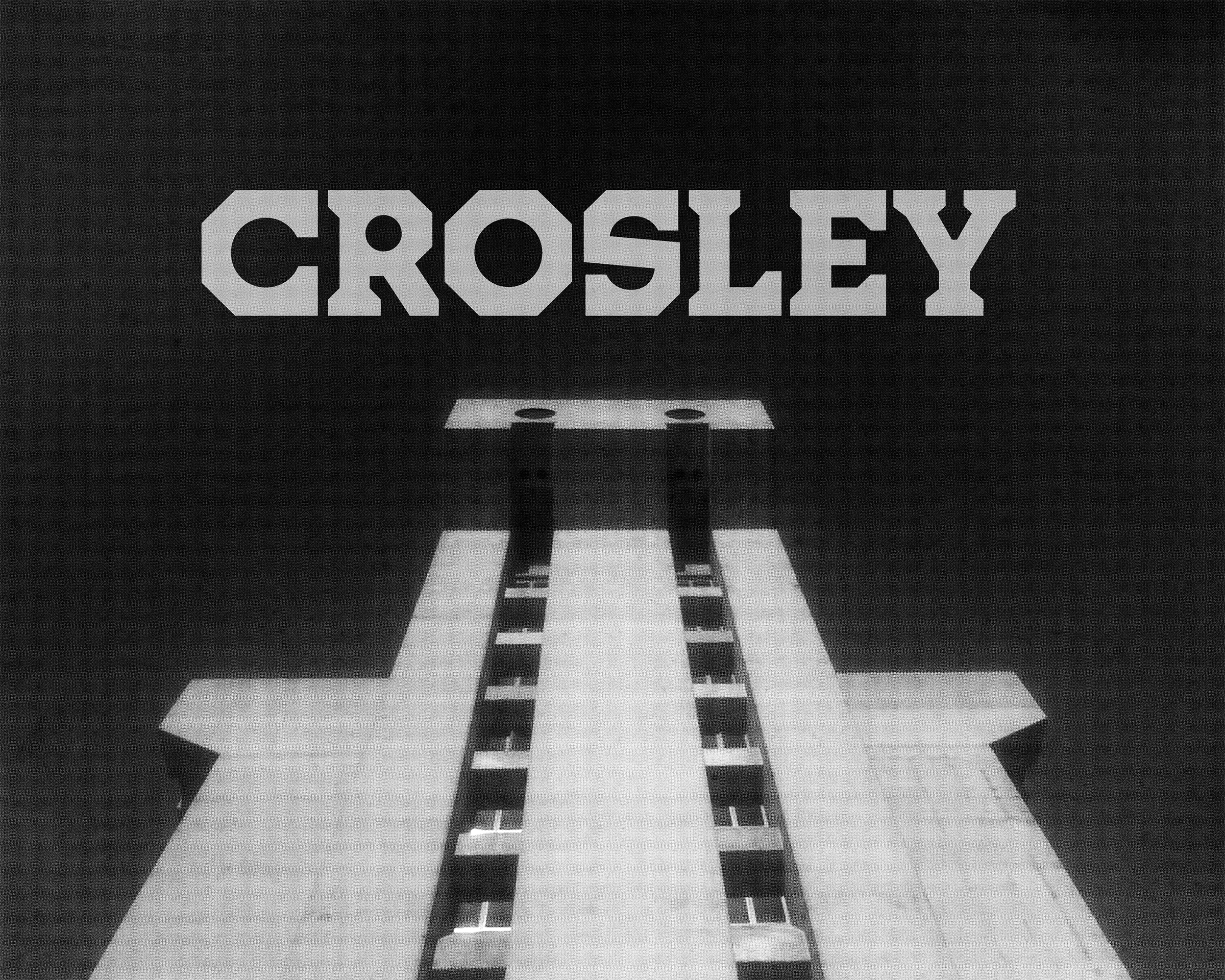
Crosley is an octic slab-serif display face and typographic ode to brutalist landmark of University of Cincinnati, Crosley Tower. Both loved and hated for its strangeness and lore, the 16-story tower is the tallest single-pour concrete structure in
the world.*
This project was an intern project done during my time working at Order︎︎︎ under the mentorship of Order Type Foundry︎︎︎.
History
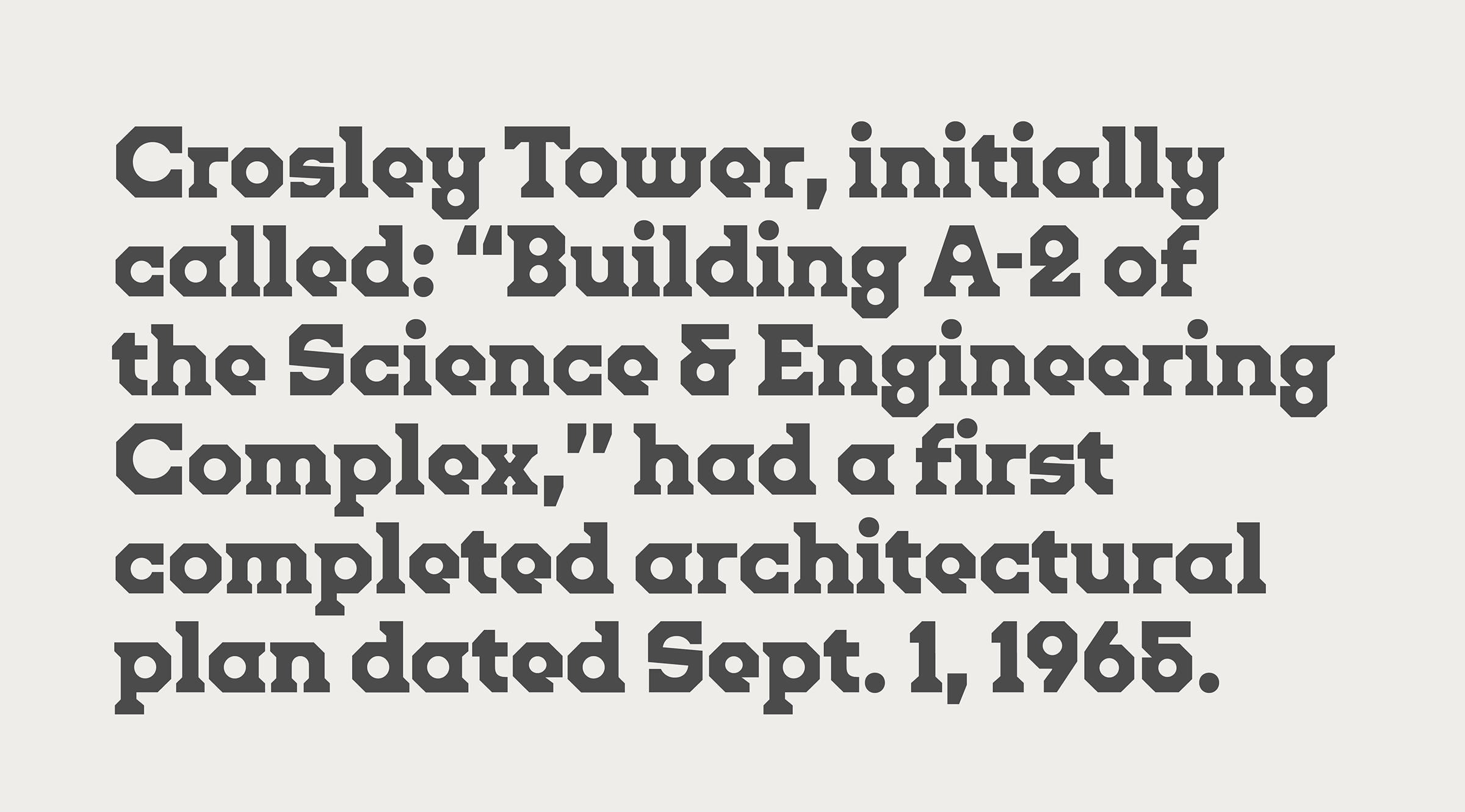
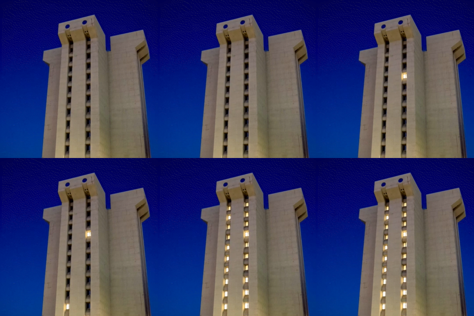
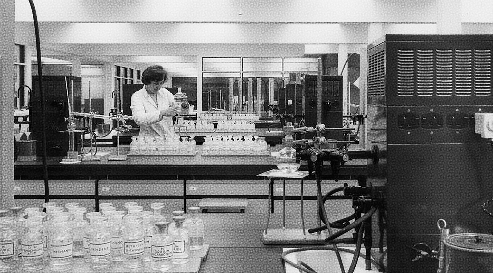
Crosley Tower, designed by A.M. Kinney and Associates, was built in 1969 to house the university’s chemistry department.
Click to Pause.
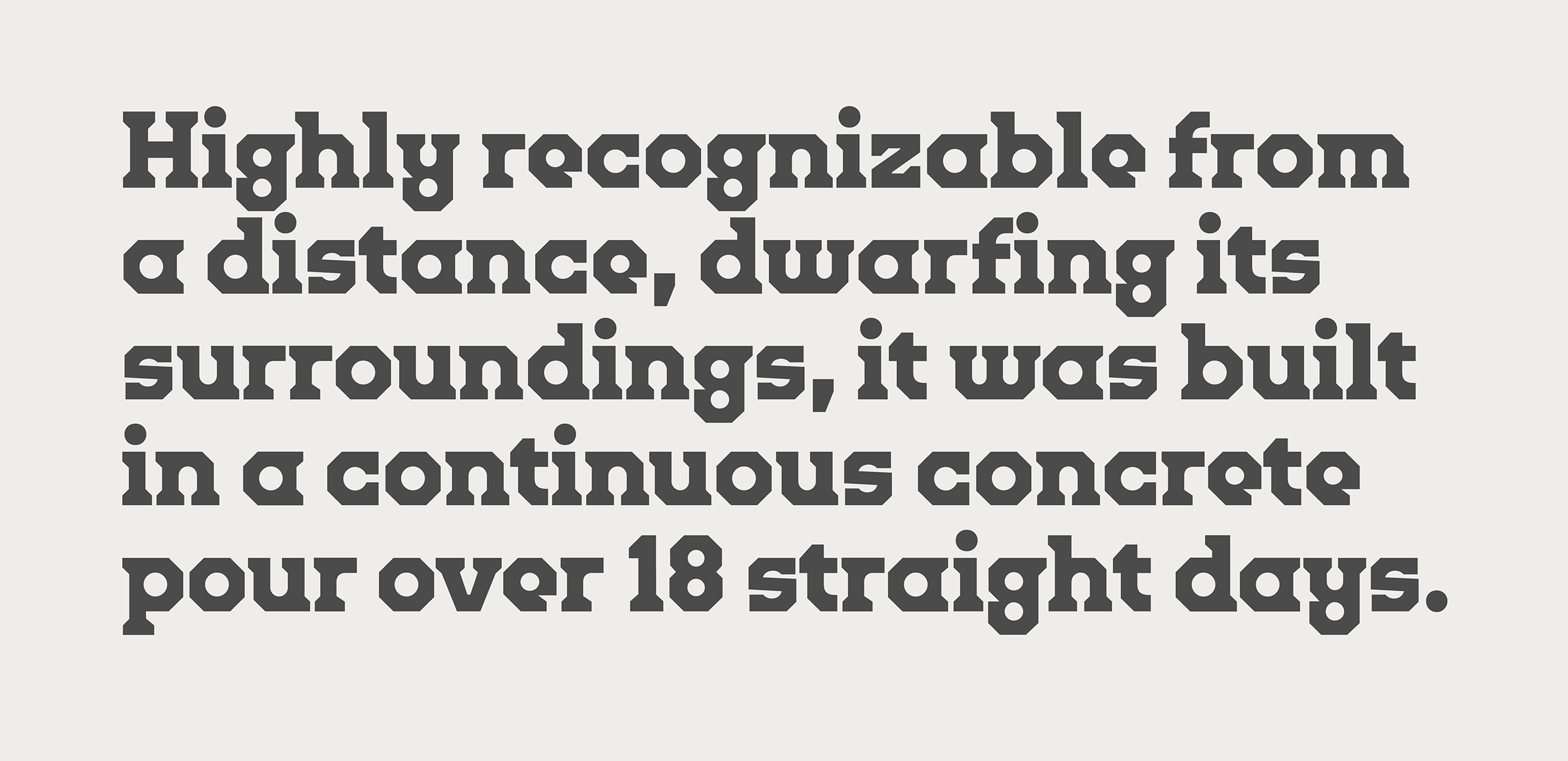
At 16 stories tall, it was constructed through a continuous single pour of concrete over the course of 18 straight days, making it the tallest continuous-pour concrete structure in the world.*
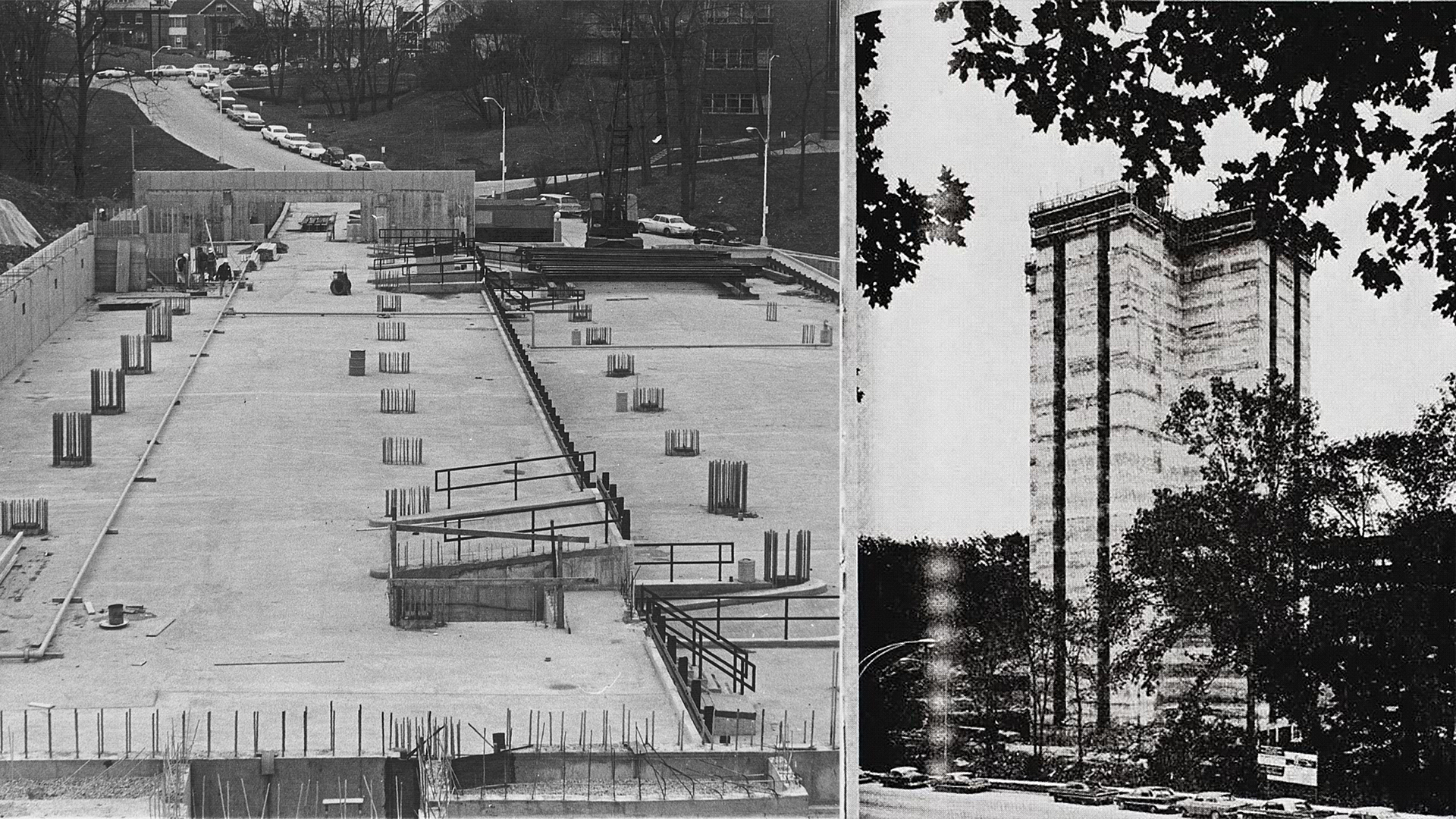
But the impact of Crosley stretches much further than just feats of engineering.
Culture
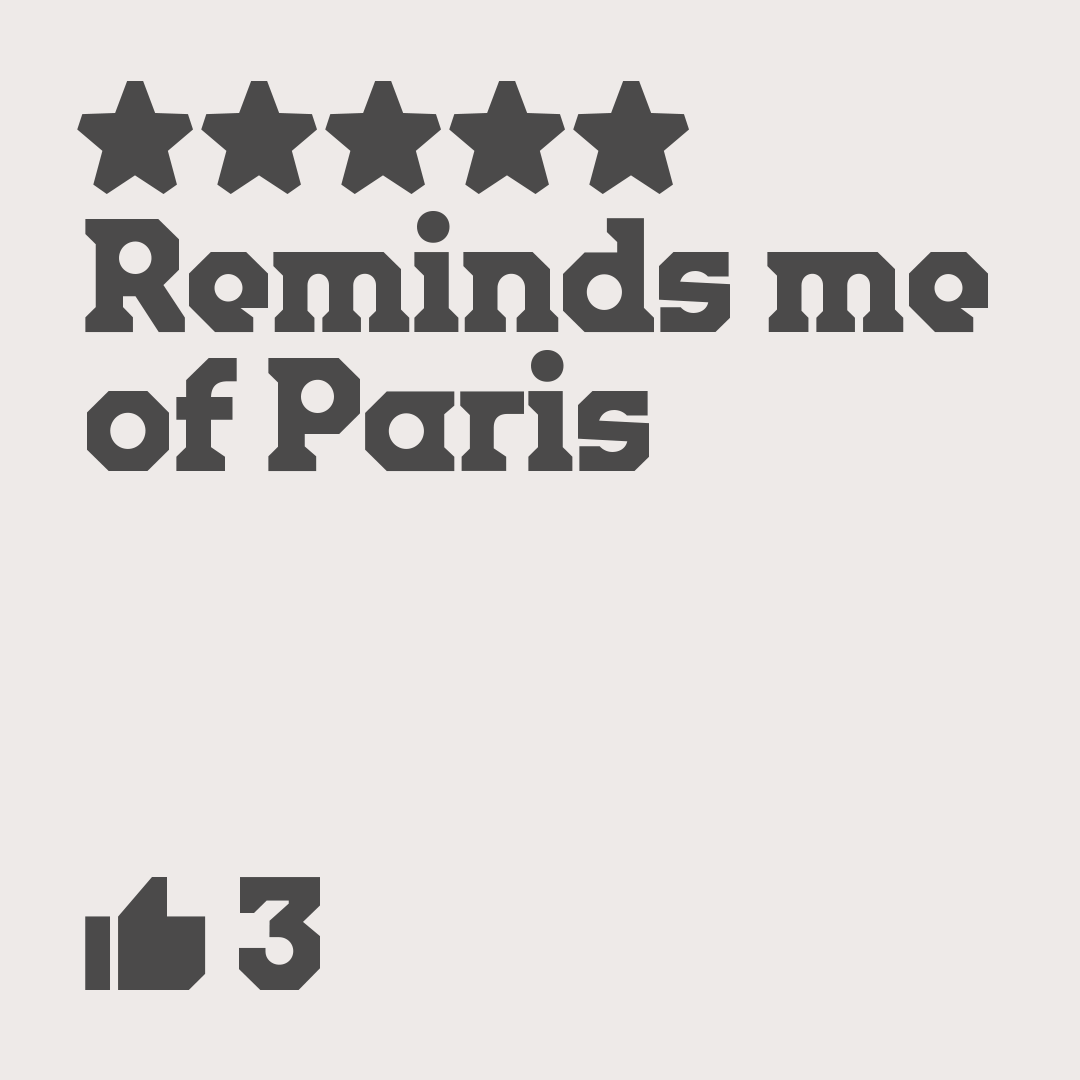
Whether you love it or hate it, everyone has an opinion on the brutalist landmark, as just a scroll through its Google reviews will show you.
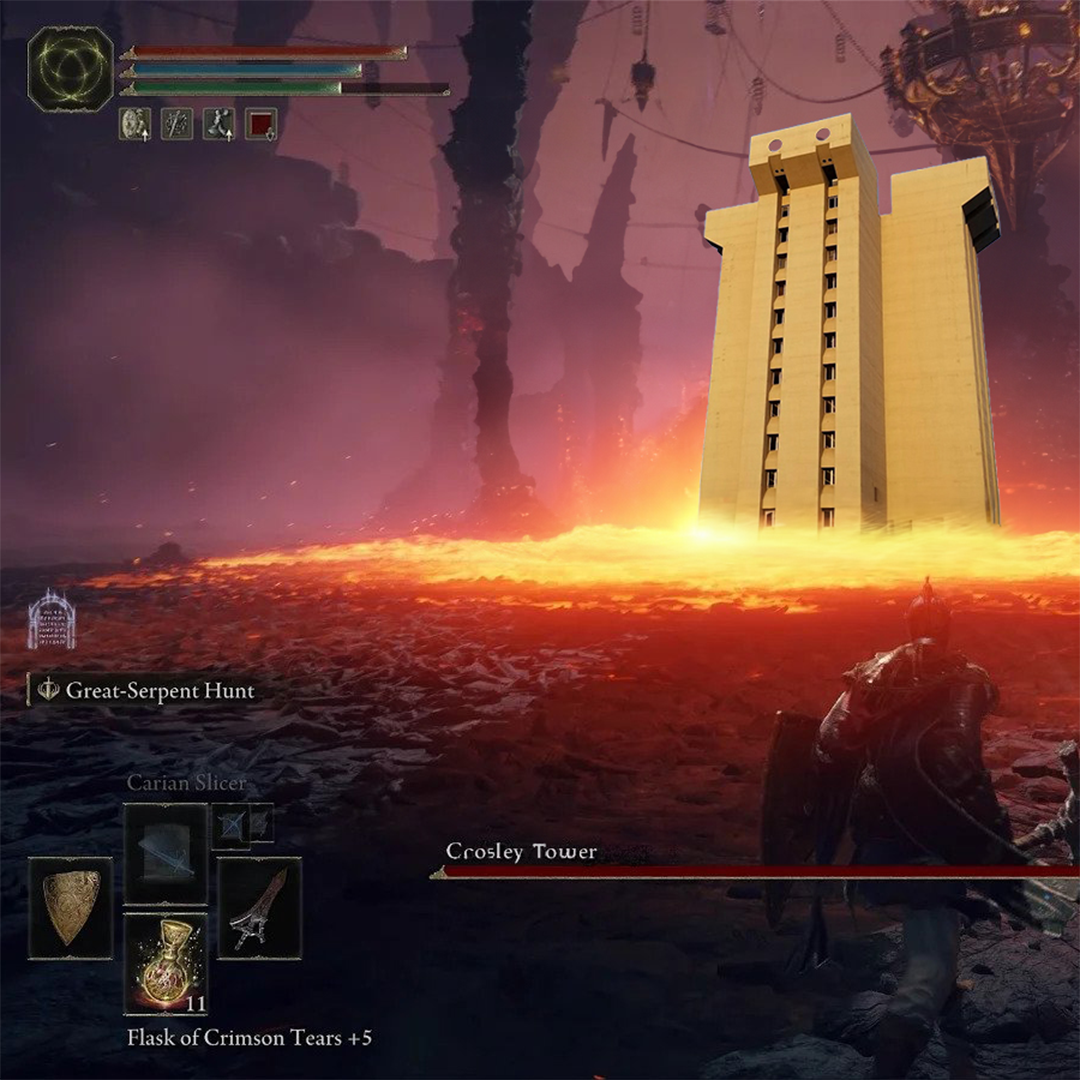
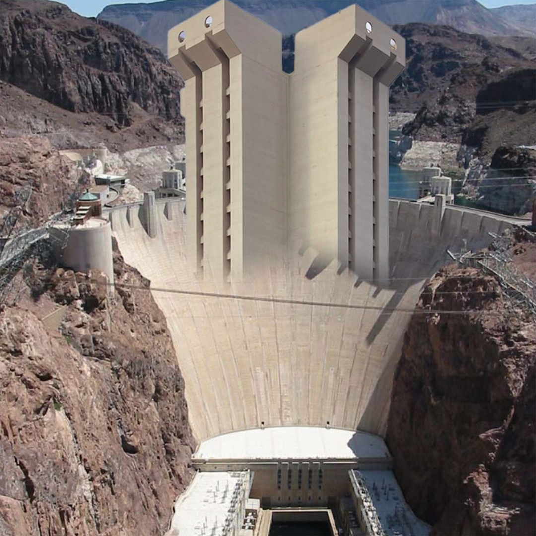
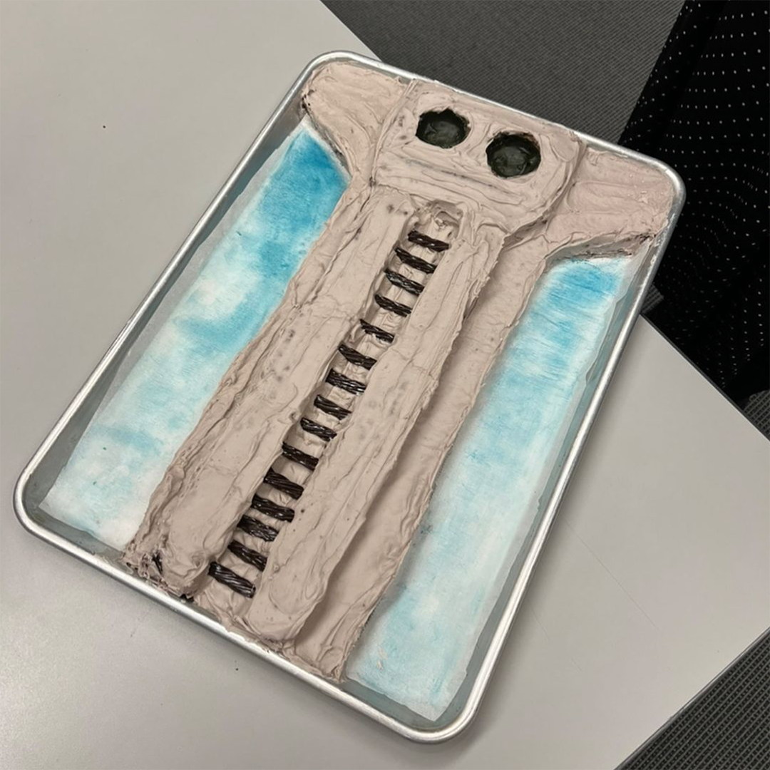
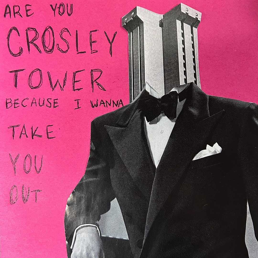
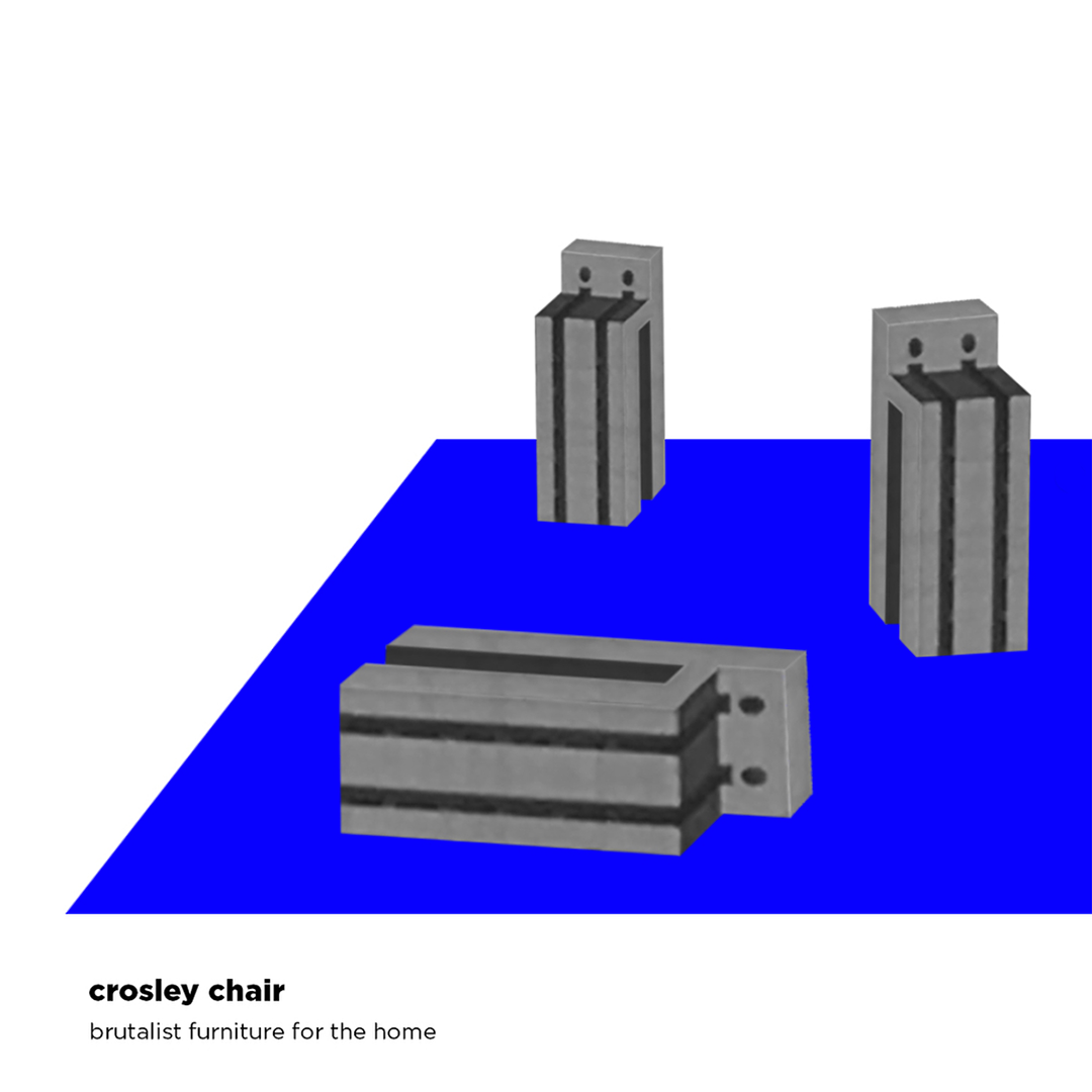
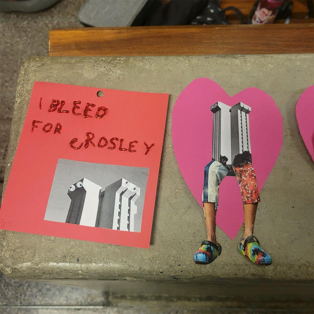
It has gathered a cult following that embraces its quirky little features with equally quirky tributes.
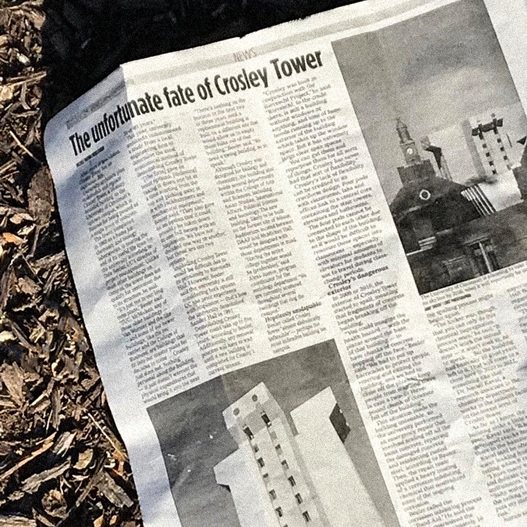
Unfortunately, a single-pour of concrete isn’t easy to maintain and the building has started to crumble. The demolition process has already begun, and in a couple years, Crosley will be no more.
But through these silly little odes to Crosley, we can preserve its memory.
And what better ode to Crosley is there than its own typeface?
Details from tower to typeface
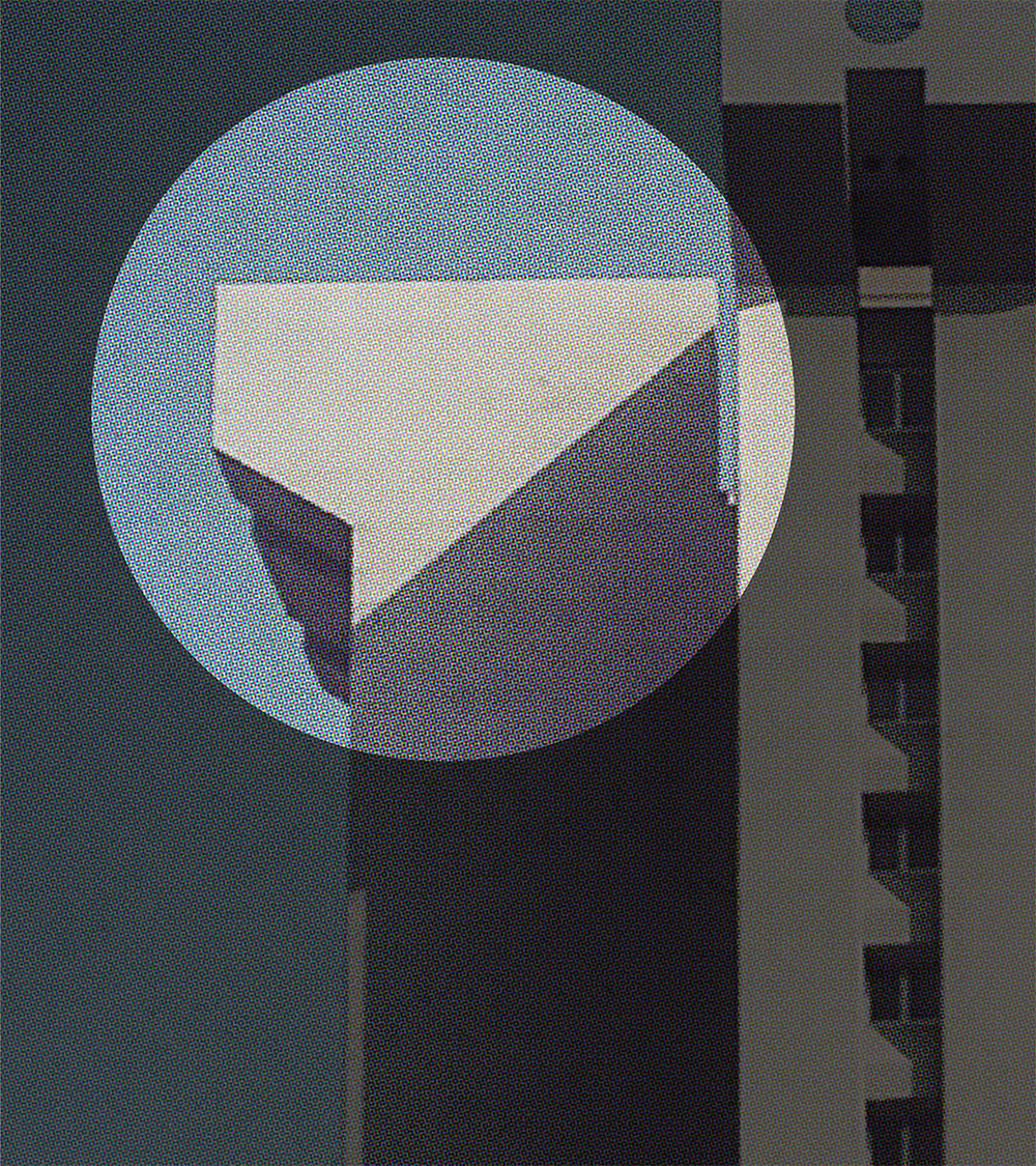
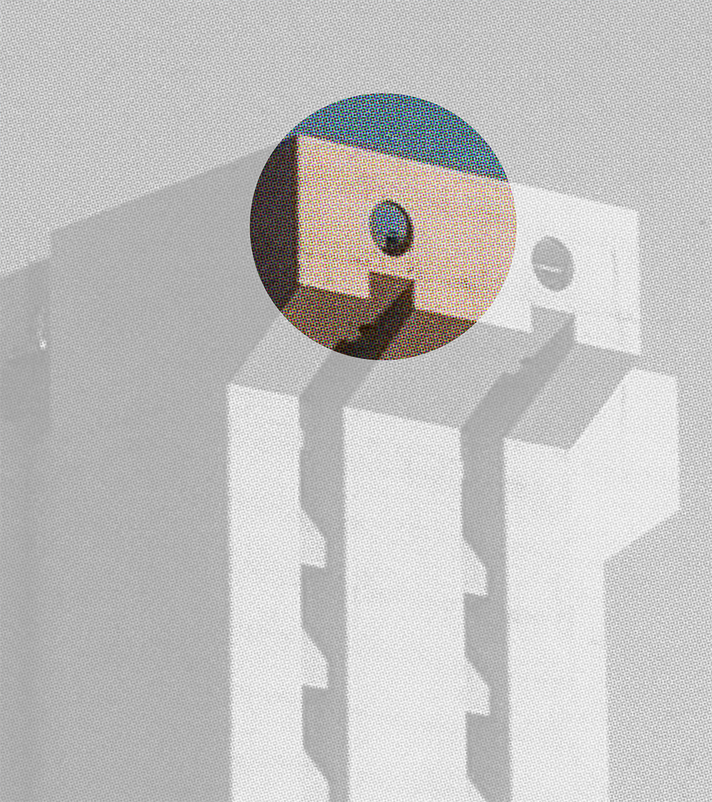
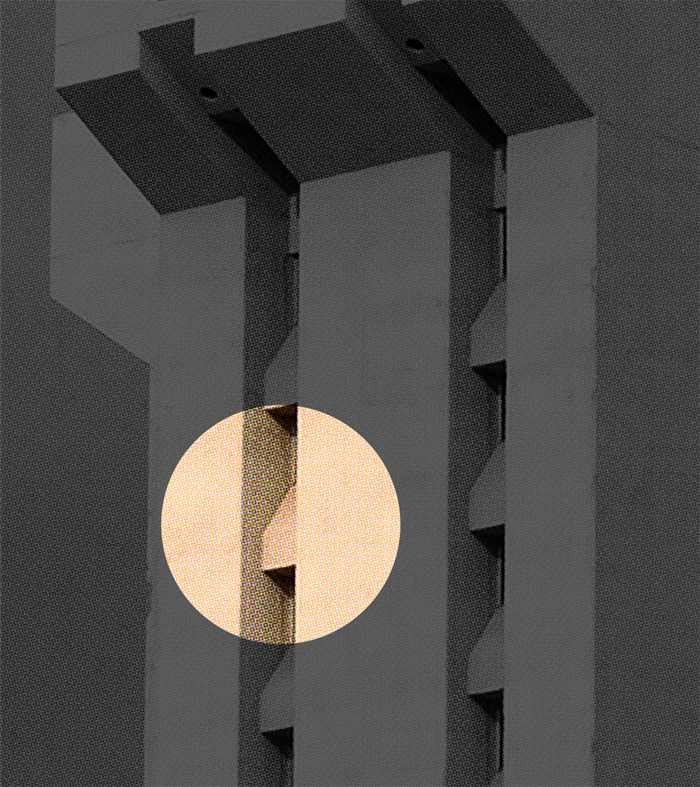
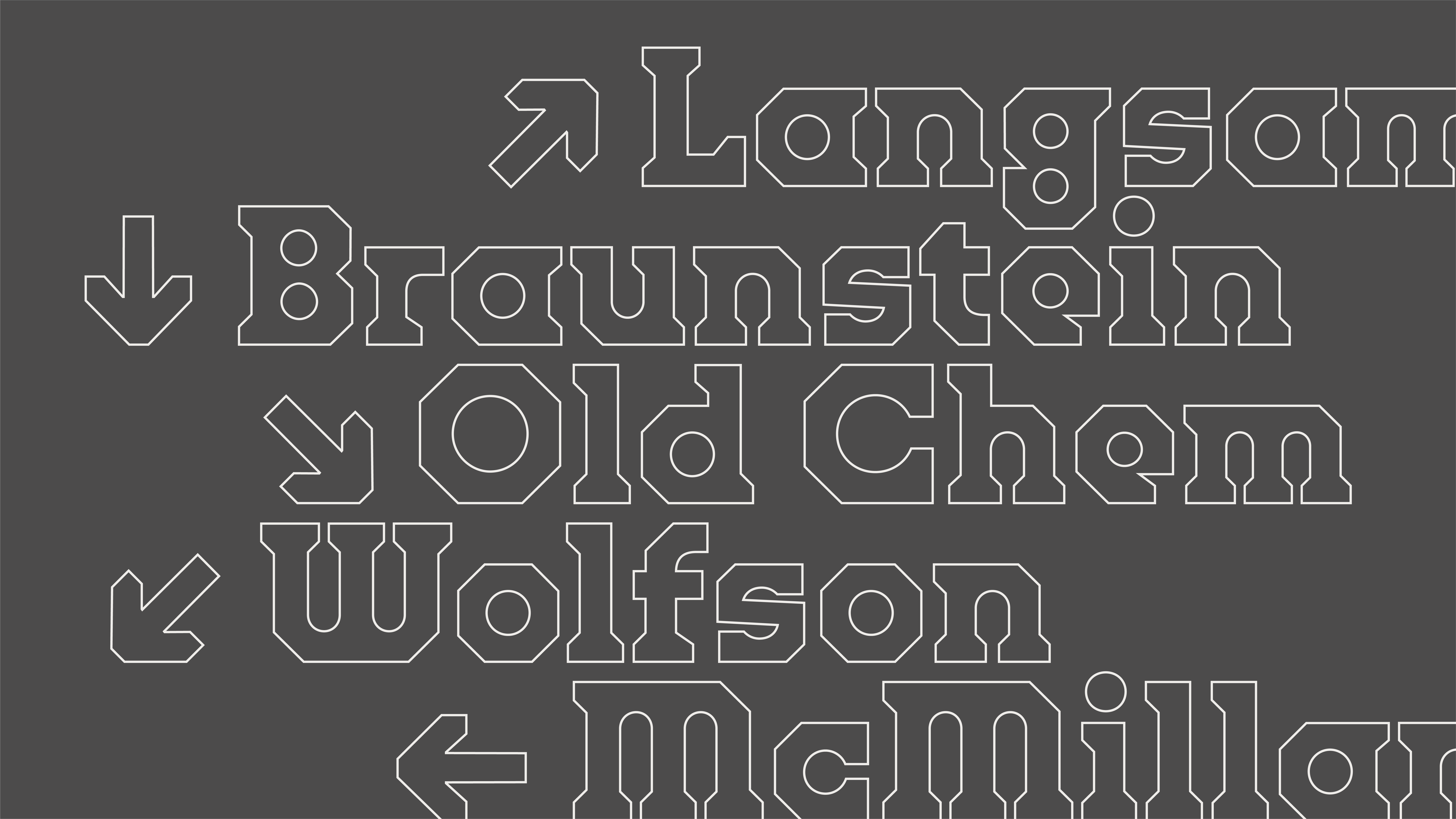
The typeface takes its forms directly from the iconic details of the building:
Hover to reveal.
Even thinking about letterforms that feel like they themselves could be constructed through a continuous pour of concrete.
Achieving this by "filling in" the gaps that would normally separate strokes with concrete.
The widths of the capitals even take a brutalist approach — the size of the counters dictate the width, even when it creates uncomfortable results.

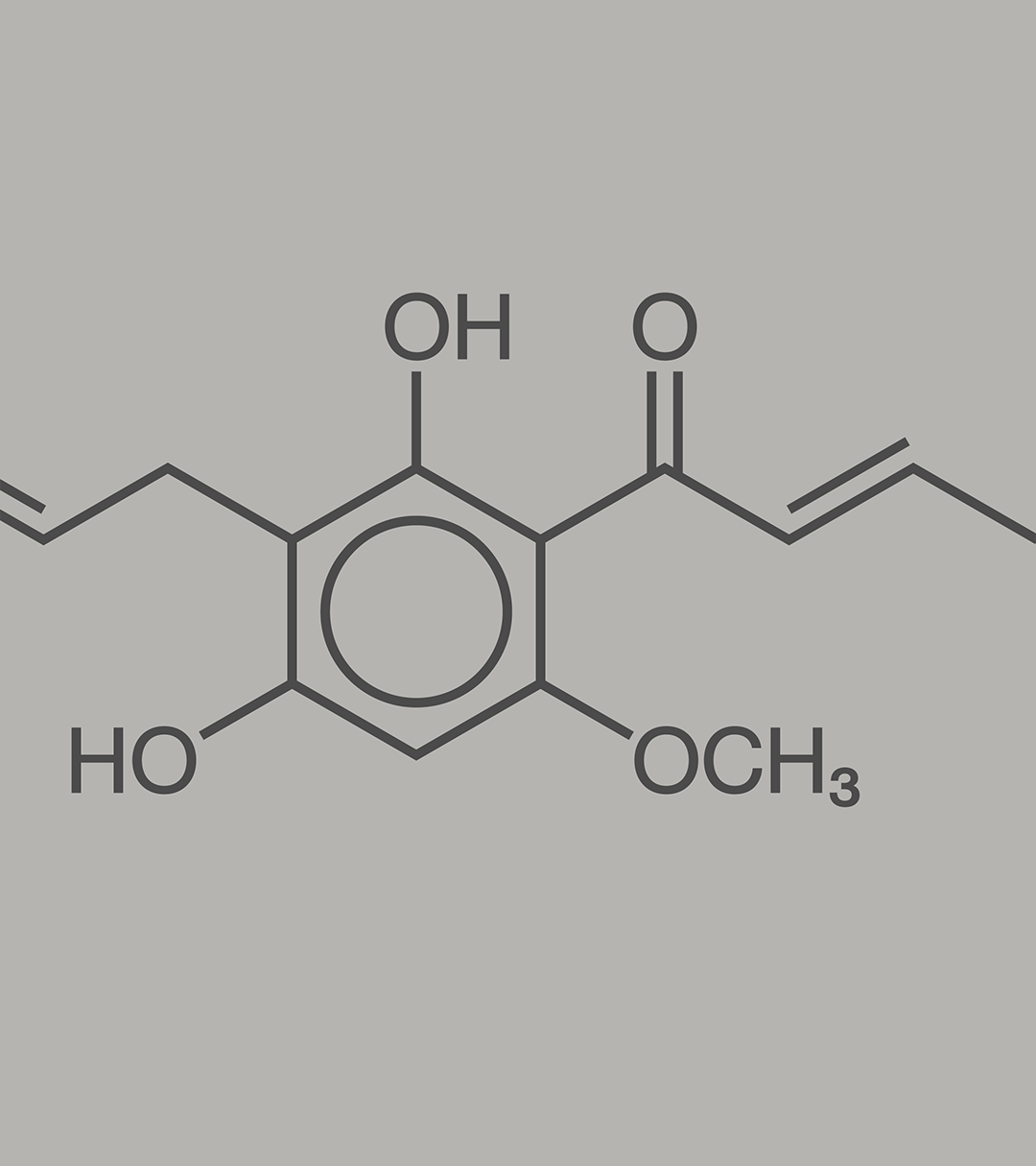
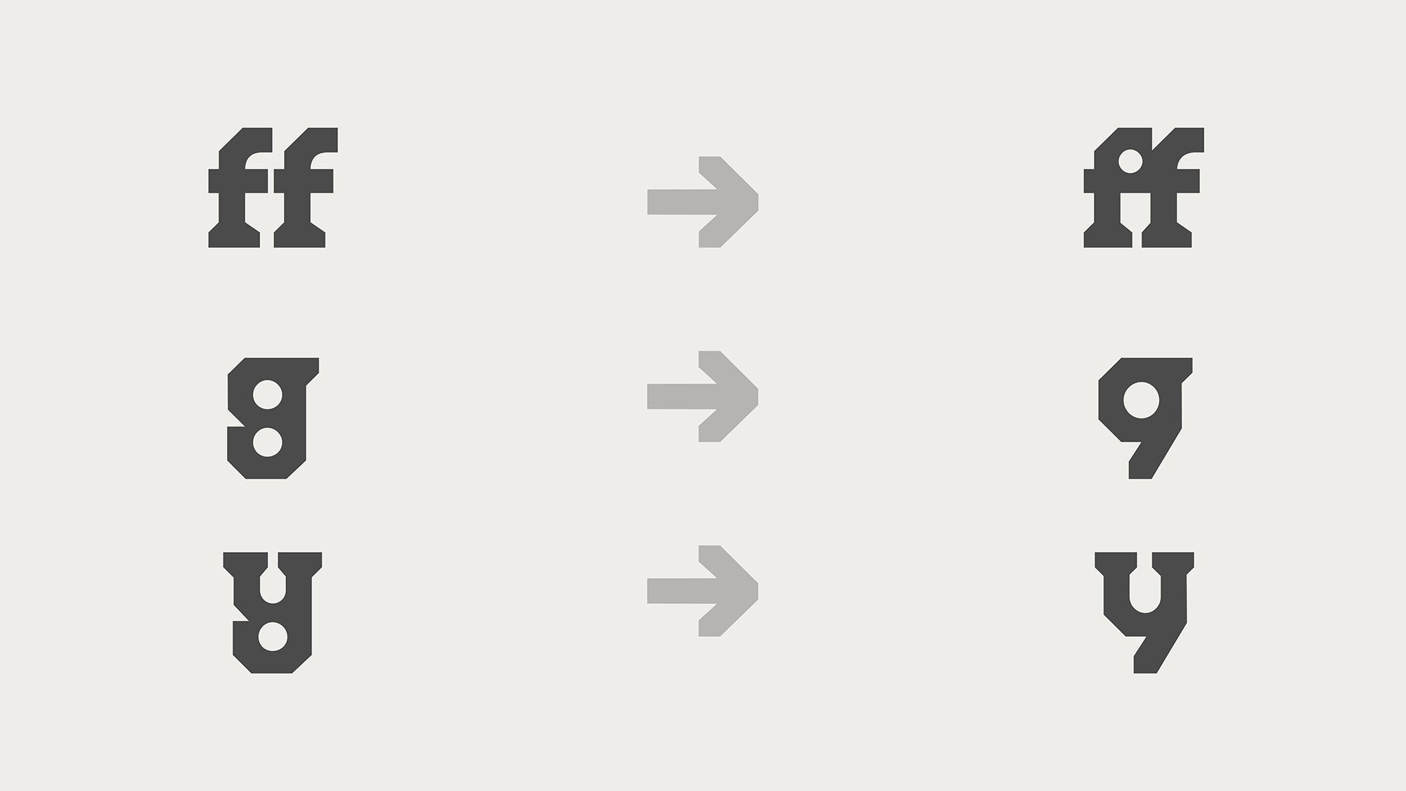
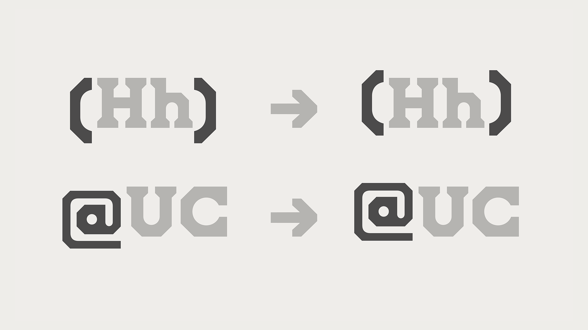
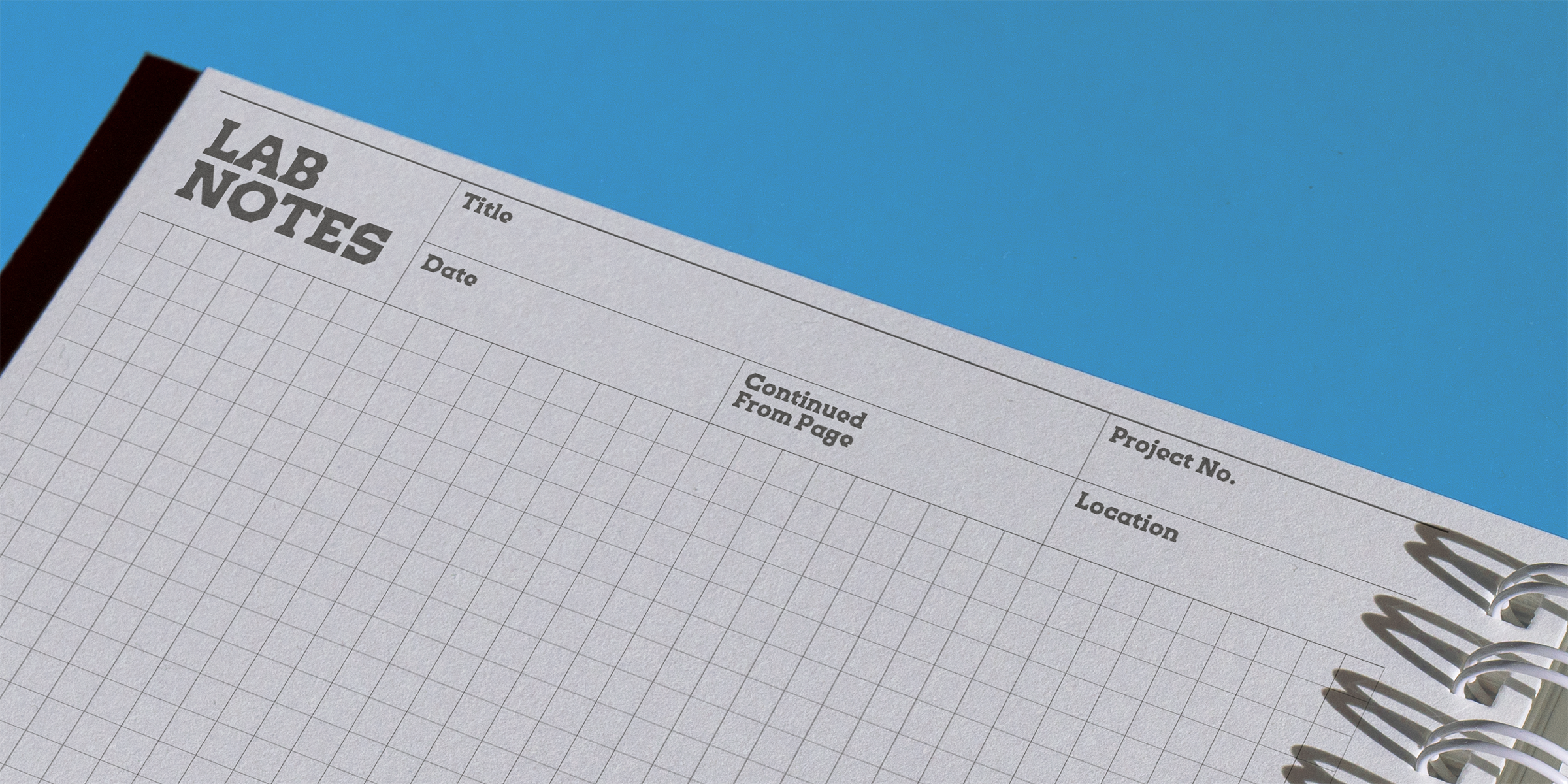
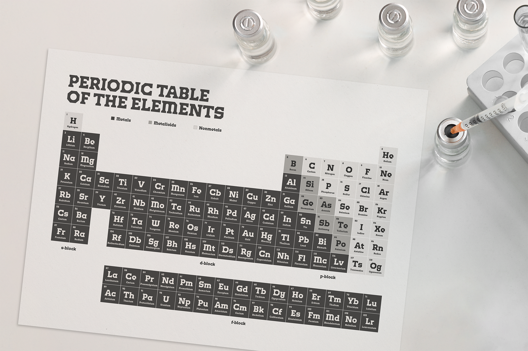
Open type features offer alternative glyphs that embody the building in different ways, case-sensitive punctuation and symbols, and small numerals for scientific applications.
Click to pause.
A brutal legacy
Like the tower and its fanbase, Crosley Display doesn’t take itself too seriously — it’s brutalist, but cute; it’s industrial, but warm; and it disregards typical type design conventions.
This all results in a typeface that carries the spirit of the architecture itself, as well as, the fans, memes, chemistry labs, and legacy. Not everyone shares the same feelings for Crosley Tower, but its eventual absence will certainly be noticed far and wide.




![]()
![]()
![]()
![]()
![]()
![]()
![]()
![]()
![]()


