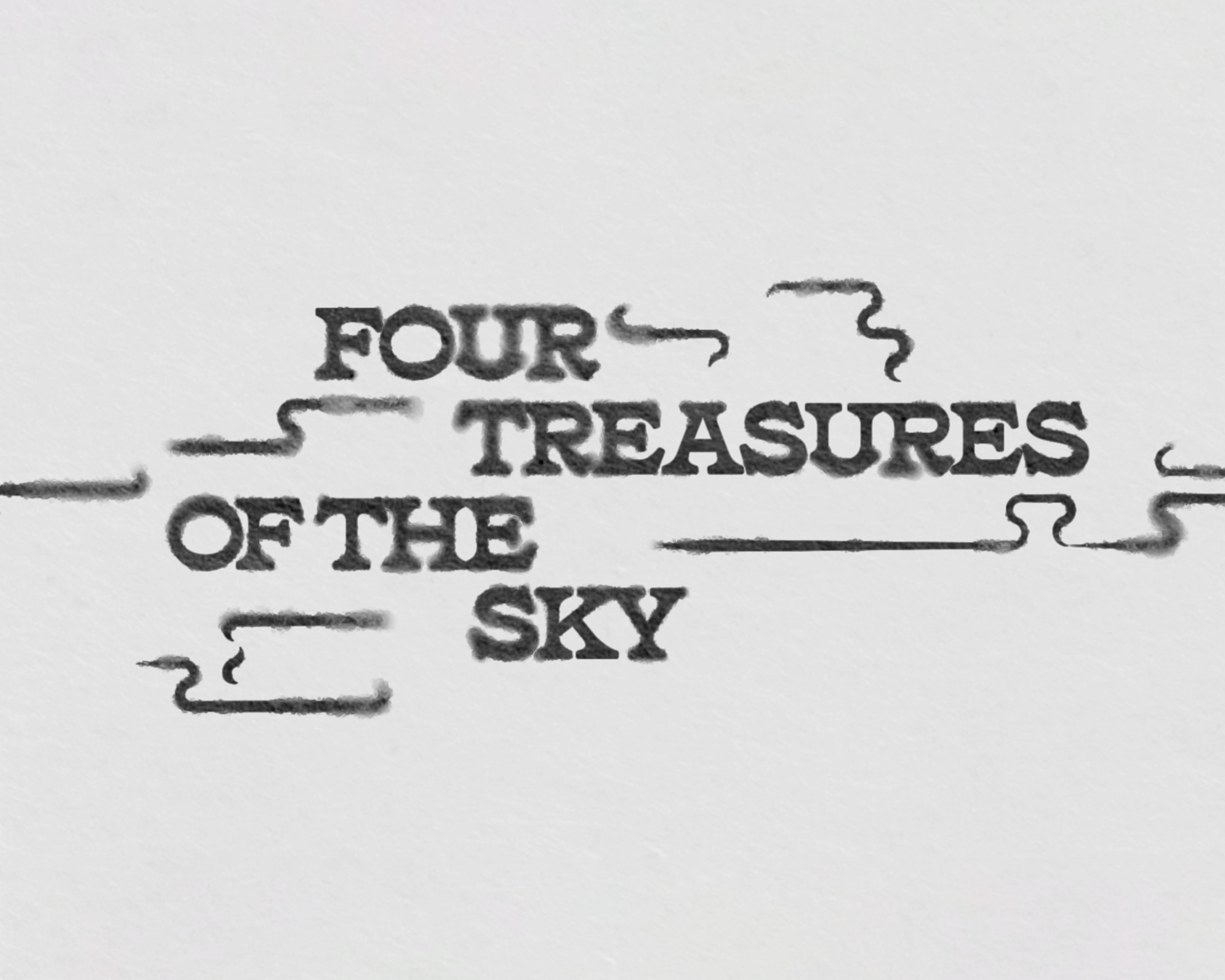
Four Treasures of the Sky
MOTION DESIGN II
This title sequence imagines Zhang's novel as a limited series, taking its graphic language from the story's contrasting settings of East and West, while playing off the idea of hidden and lost identity.


Final Storyboard
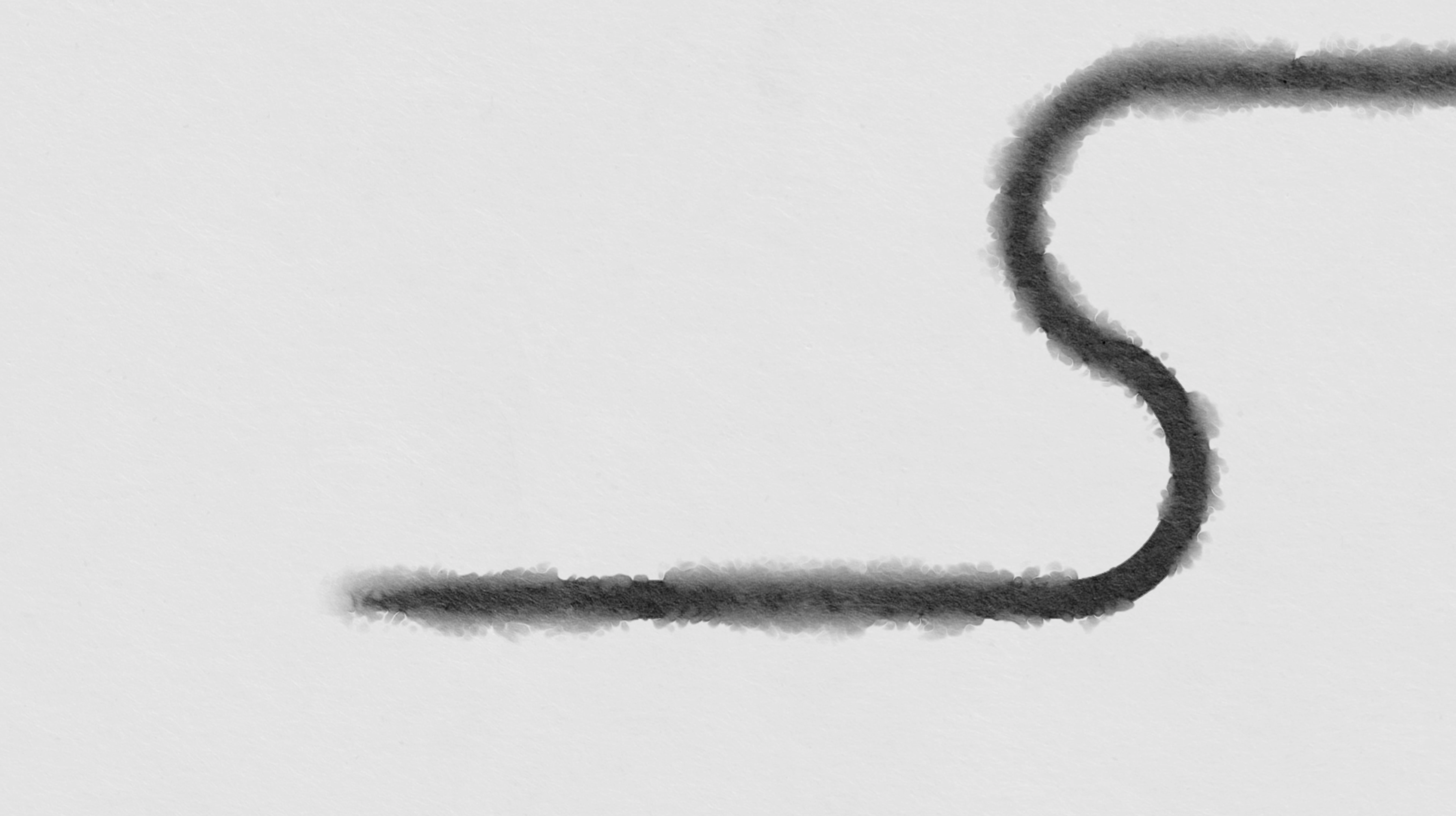
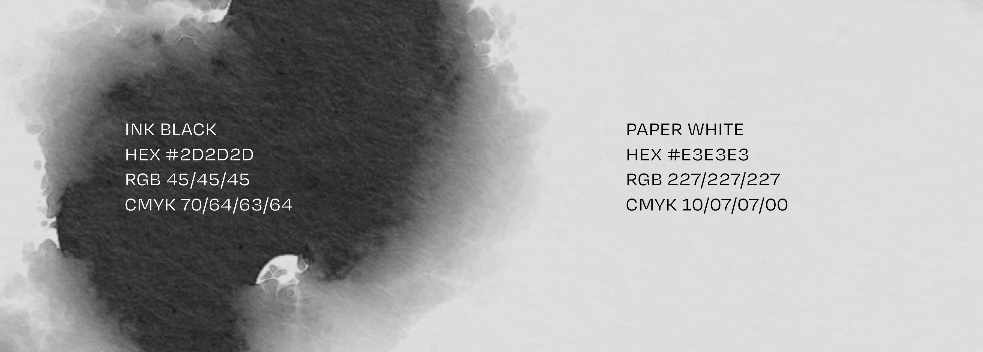
The symbolism of calligraphy
The importance of this symoblism is emphasized by the title of the novel, a play on the Chinese concept of the "Four Treasures of the Study", or the tools of a calligrapher: brush, ink, paper, and inkstone.

Source: Asian Art Museum
“A resilient brush is one that, after depositing ink on paper, can spring back up in preparation for the next stroke. But resilience is not achieved by pressing harder. No, the artist must master the art of releasing the brush, giving it the space and freedom to find itself again. Resilience is simple, really. Know when to push and when to let go.”
— Excerpt from Four Treasures of the Sky
— Excerpt from Four Treasures of the Sky
Typography and the American West
The Chinese Exclusion Act of 1882 banned all Chinese immigration into the United States for 10 years, and was the first major law restricting voluntary immigration to the country. It fueled horrific anti-Chinese racism across the country, leaving Chinese immigrants unsafe as they were killed, injured, or made to flee their homes.
Although this ban loosened slightly over the next 60 years, large-scale Chinese immigration would not be restored until the Immigration Act of 1965.

Poster from 1880s, Source: NBC News
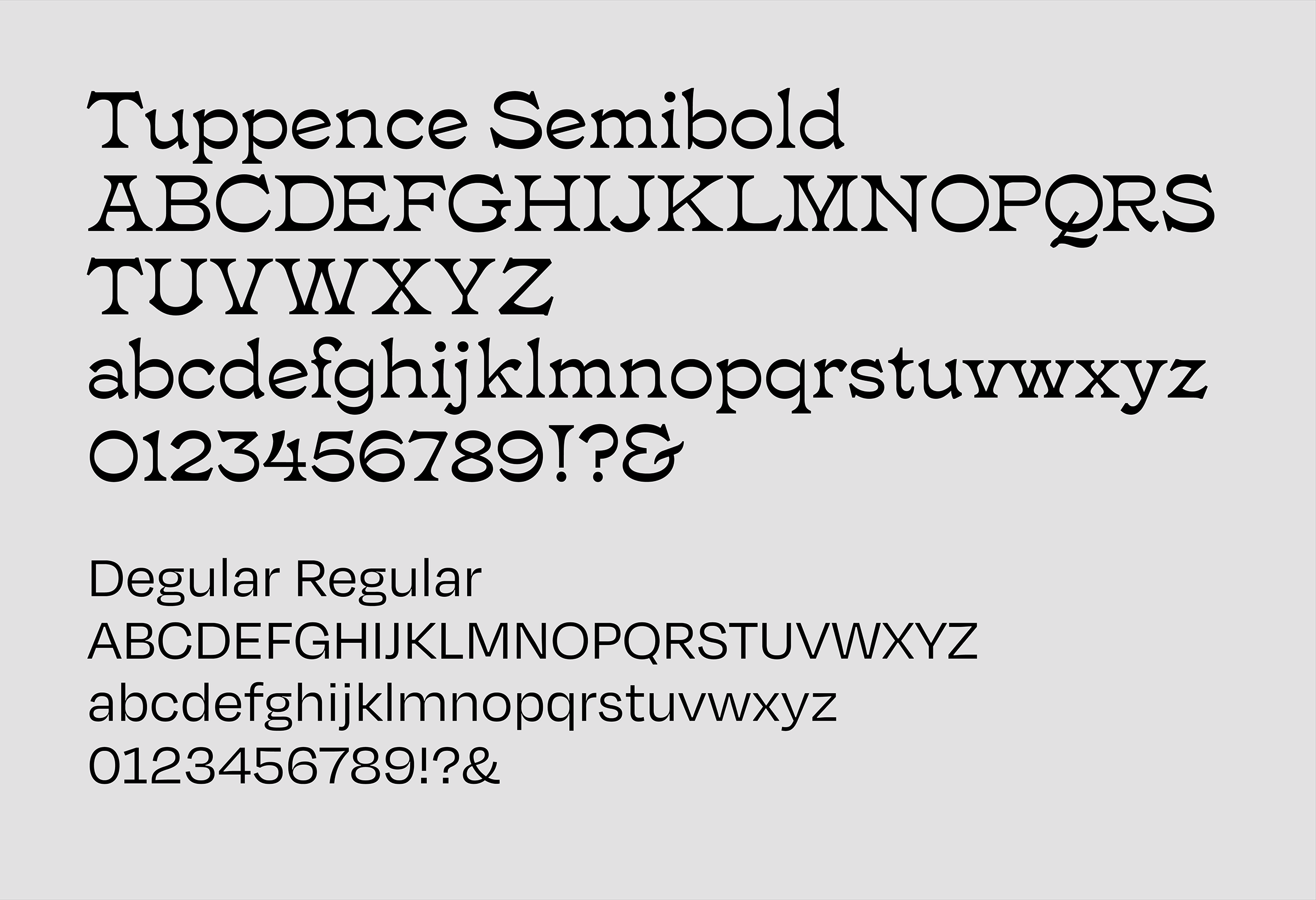
Degular is the secondary typeface, a grotesque that brings the narrative into the modern era by as this story and its societal issues are not just a relic of the past. Its skeleton matches Tuppence, with wide square proportions and generous curves.
Final Title Sequence
Daiyu's stories weave through and bleed into one another, like the brushstrokes across each frame. Her tragic story ends in darkness but with peace, as the final frames surrender to the inky black.