Fall 2023
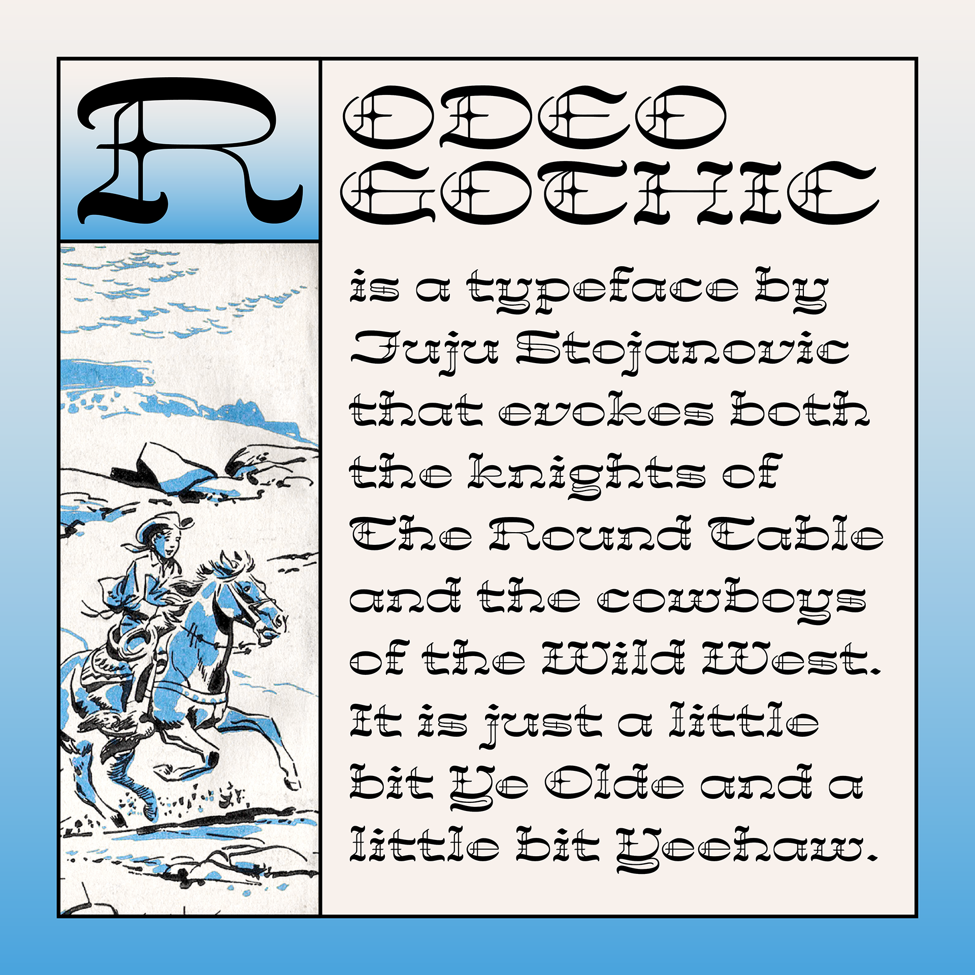
Rodeo Gothic Display Typeface
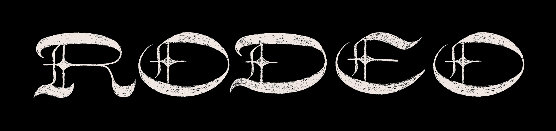
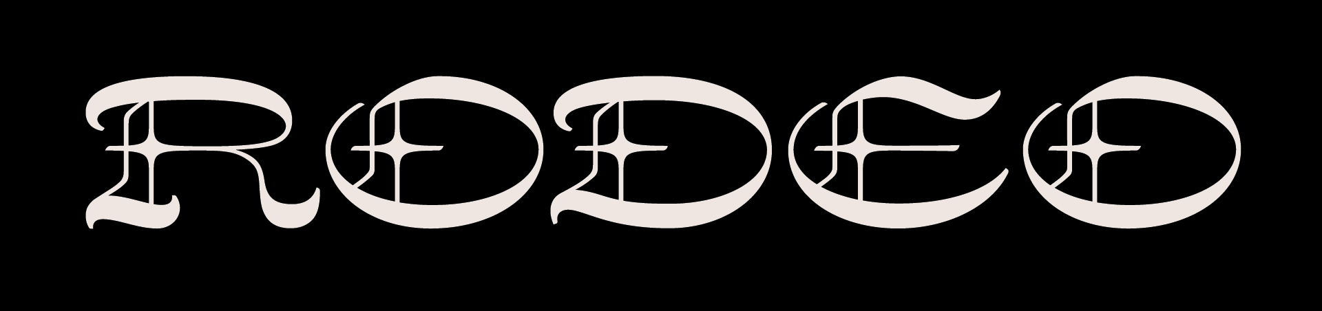
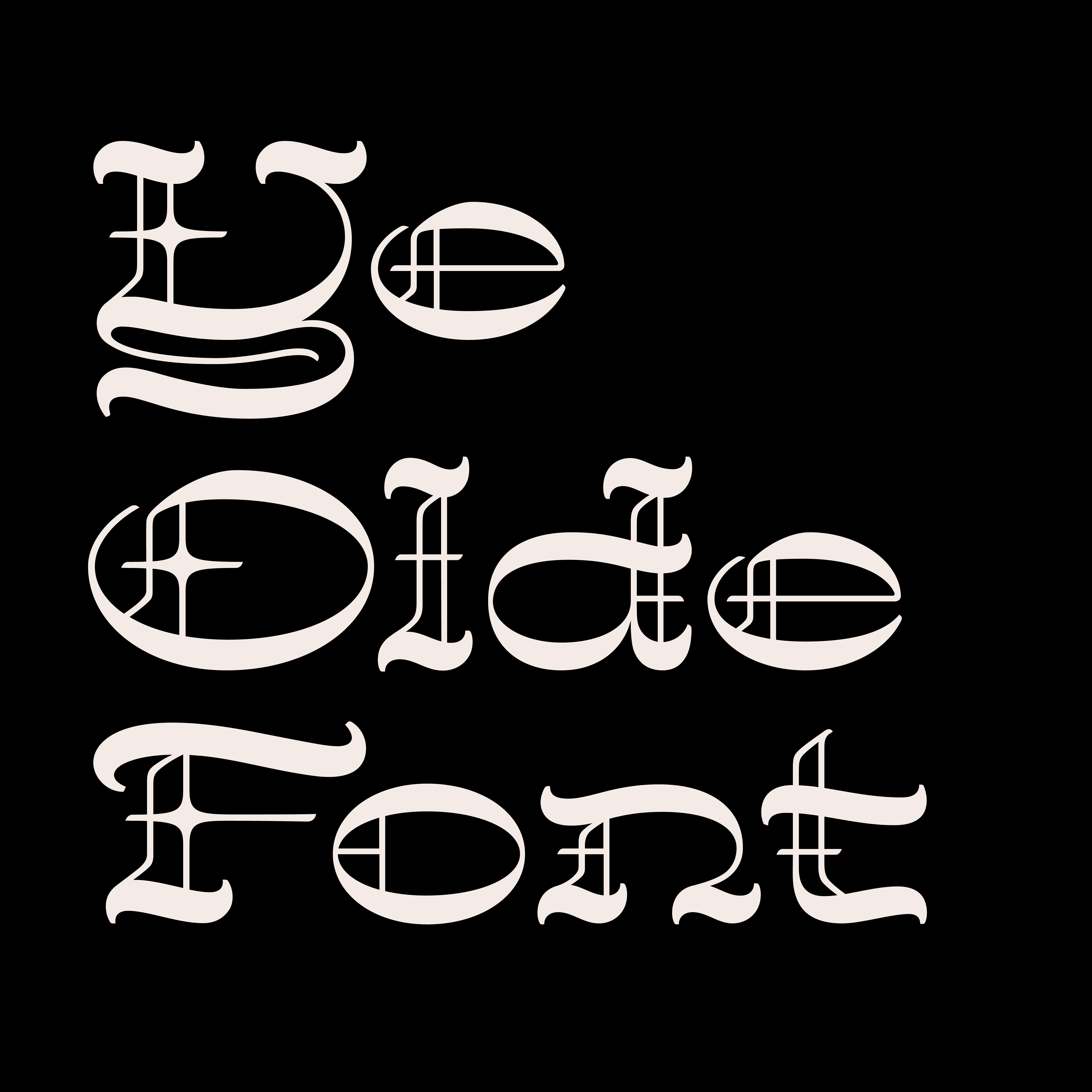
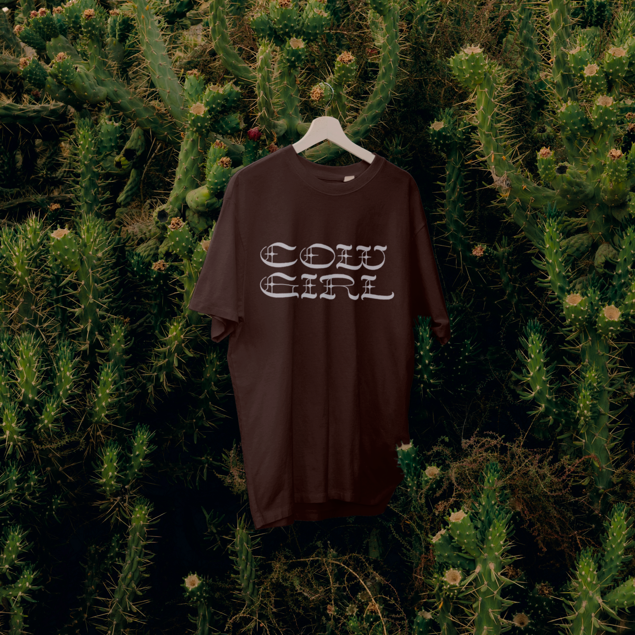
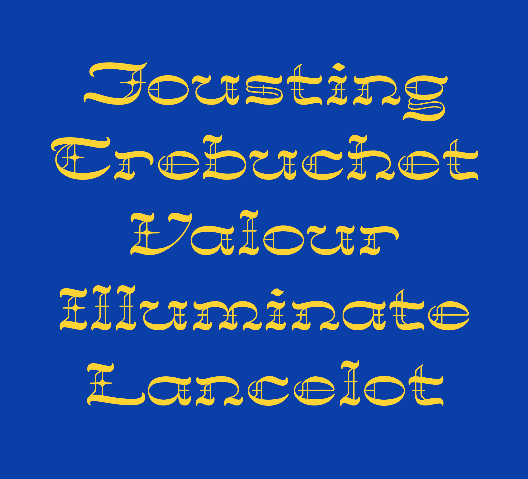
Rodeo Gothic is a display typeface that evokes both the knights of the Round Table and the cowboys of the Wild West. A mash-up of Western and Blackletter type, it’s a little bit "Ye Olde" and a little bit "Yeehaw!"
This project is my first ever attempt at designing my own typeface, and the end result of my first formal type design class — a 10-week workshop with Juan Villanueva on the Foundations of Display Type Design through Type Electives︎︎︎.
What do Western type and Blackletter have in common?
The idea for Rodeo Gothic came out of a blackletter-ish sketch where I was playing with the space-filling internal ornamentation of blackletter. I realized that these little diamond strokes reminded me of the sharp spurs that are sometimes seen in western type.
Breaking down research
To figure out how to bring these drastically different worlds together, I studied references for Western woodcut type and Blackletter calligraphy. I then identified some defining elements that commonly occur in each style and started thinking about which ones I could take into my mash-up.
Blackletter
- Originates from broad-nib pen
- Distinct and complex letterform construction
- Space-filling internal ornamentation and double-strokes
- 45-degree stroke contrast
- High stroke contrast
Western
- Originates from woodcut type
- Exagerrated widths, i.e., narrow or extended
- Vertically centered spurs
- Horizontal contrast
- High stroke contrast
Calligraphic ideation
With these style elements in mind, I quickly sketched, trying to understand how I could create a set of rules that could apply to the various constructions of letterforms by using the tool from which blackletter originates: the broad nib pen.
Handling stroke contrast with a monoline approach
One of the greatest hurdles for me during ideation, was figuring out how to handle the stroke contrast of my mash-up. Blackletter and Western type are two styles in which contrast can be one of the most visually defining characteristics, but the two have very opposite approaches to contrast.
My breakthrough moment was when I saw a monoline interpretation of blackletter and realized that I could use this to keep the rough skeleton of Blackletter construction, while giving extra weight to the horizontals to create the signature Western look of reverse contrast.
![Credit: Matthew Smith]() Credit: Matthew Smith
Credit: Matthew Smith
Final direction
The final direction was born with a sketch of the word, "RODEO," where the letterforms loosely retain Blackletter construction combined with the wide horizontal stress common in Western type.
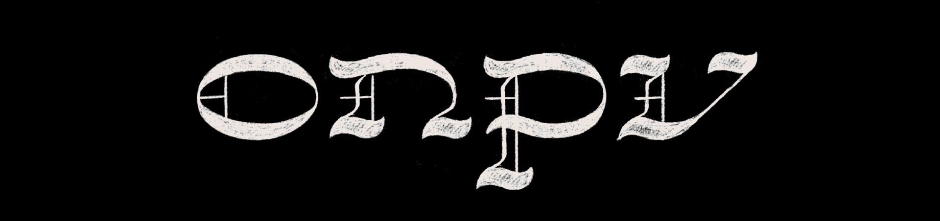
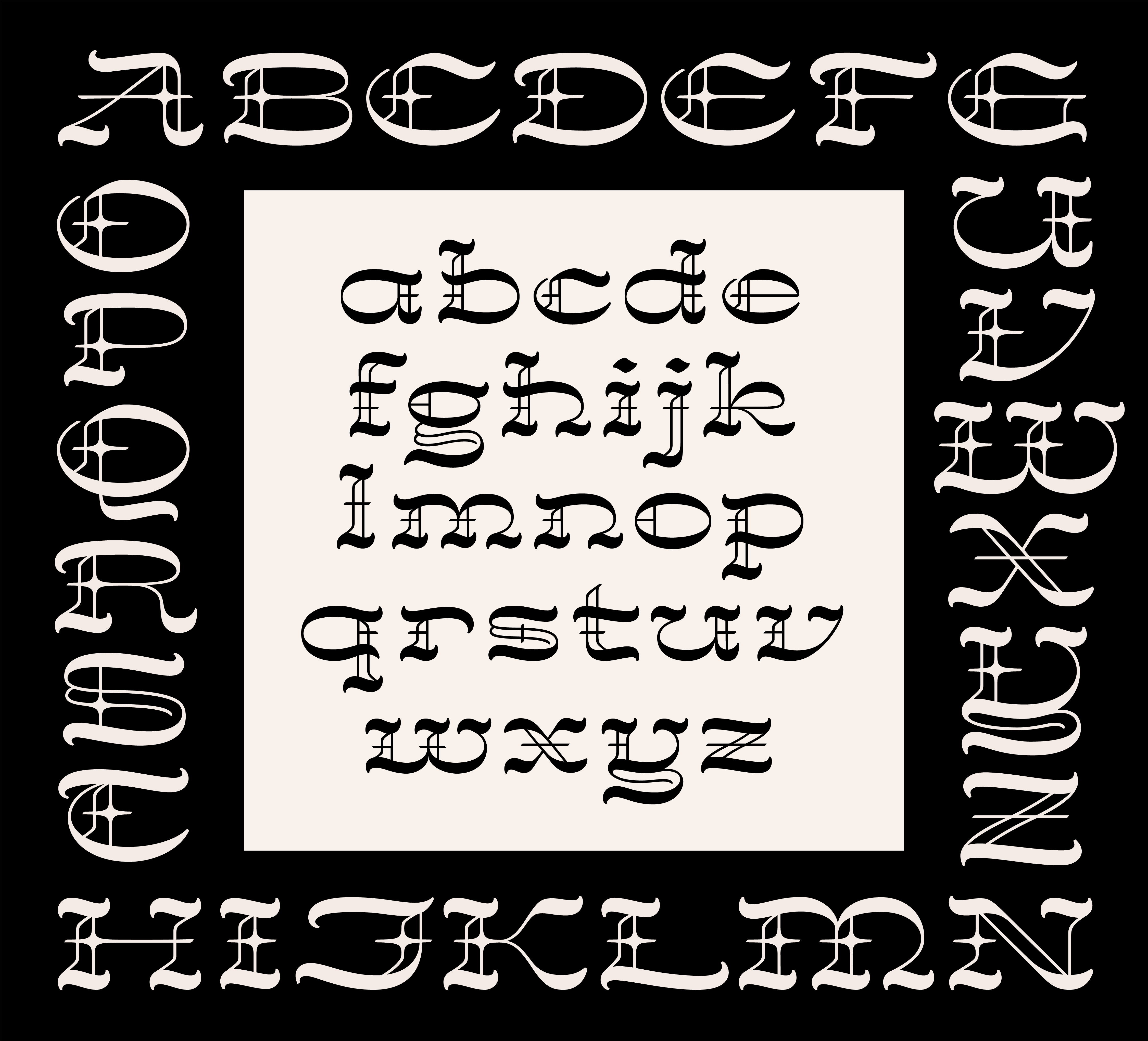
As I began the lowercase control characters, I wanted them to have a similar level of Blackletter-ish ornamentation to the uppercase, even though lowercase Blackletter traditionally does not appear that way.
Troubleshooting difficult letters
With such a specific set of visual rules, two of the trickiest letters to figure out were the lowercase g and y. I tried both single- and double-story g's, and different constructions of the y that were more or less Blackletter. The short descenders also made it a challenge to figure out where to put the heavy strokes versus the doubled thin strokes.


 Credit: Matthew Smith