ЛЕПА 珠珠 СТOJАНOВИЋ

ЛЕПА 珠珠 СТOJАНOВИЋ

Fall 2022

Push+Shove Magazine


TYPOGRAPHY III

Editorial Design · Visual Identity
Push+Shove is an arts and culture dance publication that challenges tradition and focuses on the multidimensionality of dance. It breaks the conventional ideas of dance as pretentious, old-fashioned, and delicate, and highlights it instead as expressive, versatile, and innovative.

Promoting diverse and inclusive perspectives, it puts the disruptors of today’s dance landscape centerstage; the dancers, choreographers, directors, and more who refuse to keep dance and its culture stuck in the confines of the past.


Who is Push+Shove?


I started by creating a list of words that describe the magazine's identity, and a list of words that I did not want associated with it.
︎ Expressive
︎ Disruptive
︎ Propelling
︎ Rebellious
︎ Rhythmic
︎ Diverse
︎ Experimental
︎ Unexpected
︎ Stagnant
︎ Dull
︎ Pretentious
︎ Conservative
︎ Traditional
︎ Delicate
︎ Monotonous

Initial wordmark sketches
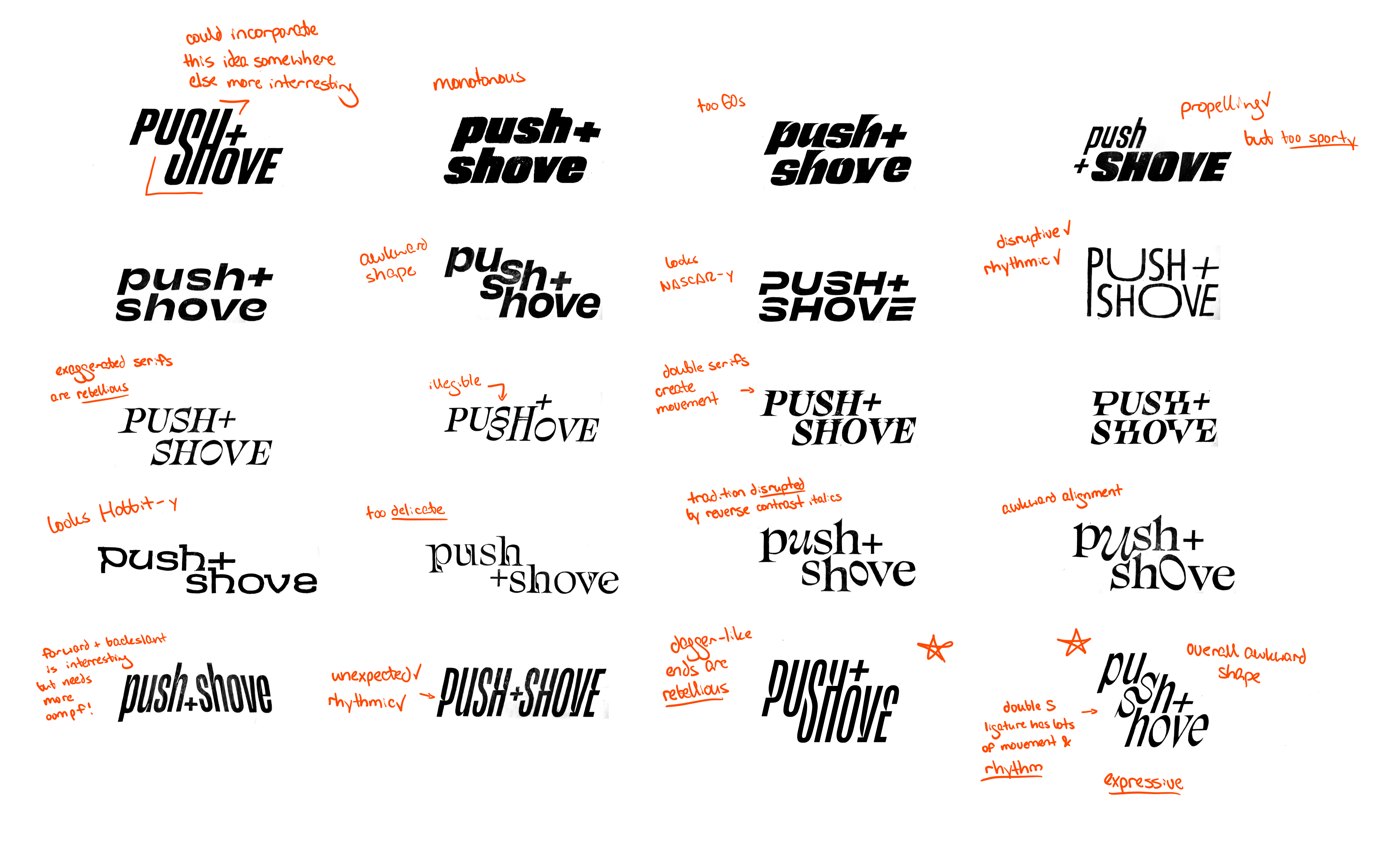

Building off of some base typefaces that embodied the above adjectives, I began sketching initial wordmark ideas. I analyzed my sketches for which conveyed the descriptors I was looking for, and which conveyed qualities that I was trying to avoid.

Final wordmark


I narrowed in on the double-S ligature idea created through the sketch process because of its movement and rhythm. Additionally, the combination of sharp pointed serifs and high contrast letterforms were rebellious, while the intense forward slant was propelling.
However, the alignment created by the ligature made an awkward overall shape for the mark. To fix this, I consolidated the ligature into a single disruptive but expressive S that "pushes" into the second line of text.
Click to Pause.

Abrasive colors


The final colors were derived from a complementary color harmony of green and red, but shifted warmer with more yellow added to achieve greater tension between the two with an overall electrifying quality.
The gray is slightly warm as well, and is similar in value to the other two colors, creating competition between the three colors to the viewer's eye.

Rebellious and dance-like typography


Three typefaces are used across the publication. All were chosen for either their rebellious attitudes or dance-like qualities. Italics are used throughout because of their propelling movement and connection to the magazine wordmark.

Wide page proportions mimic a stage
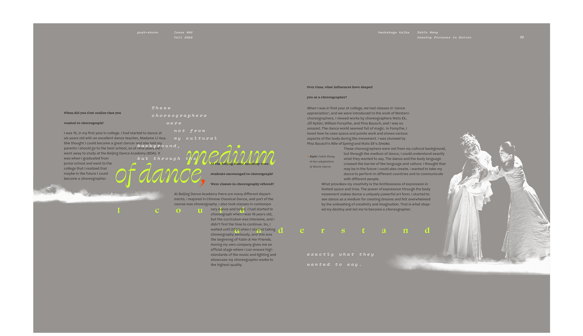
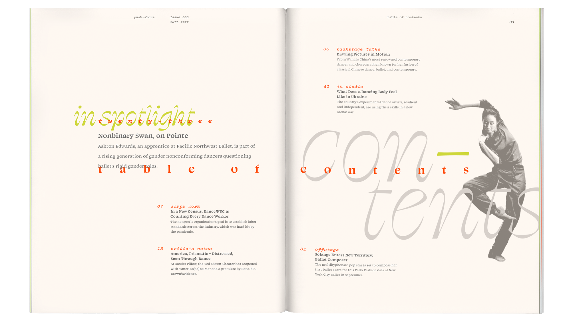
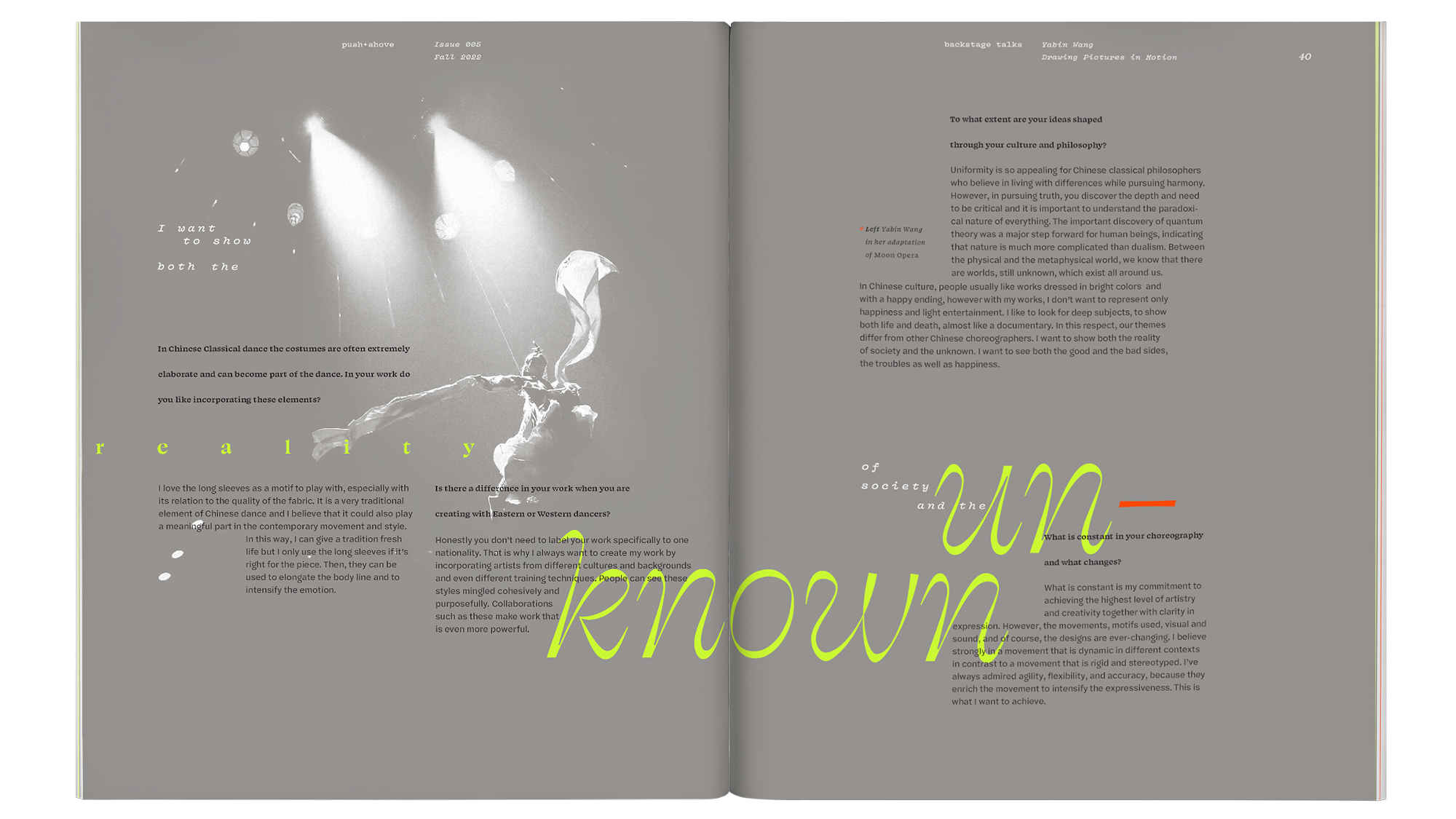
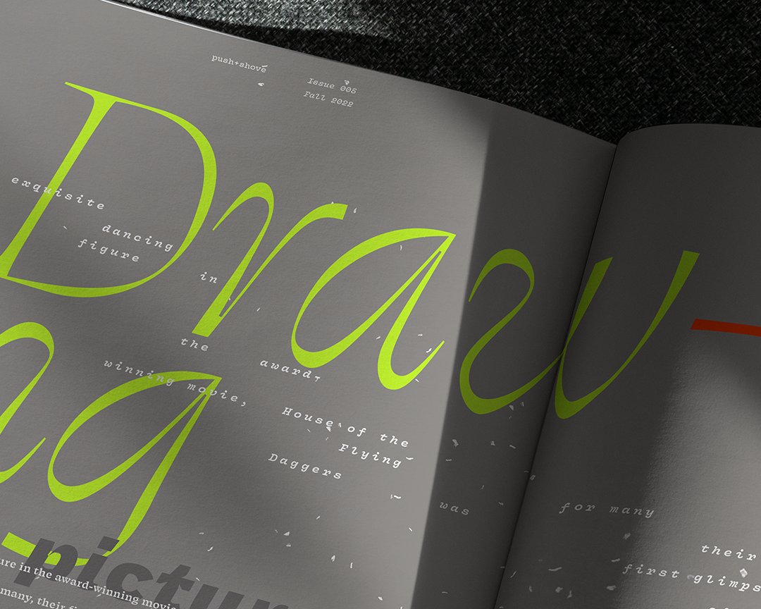
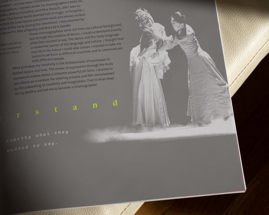
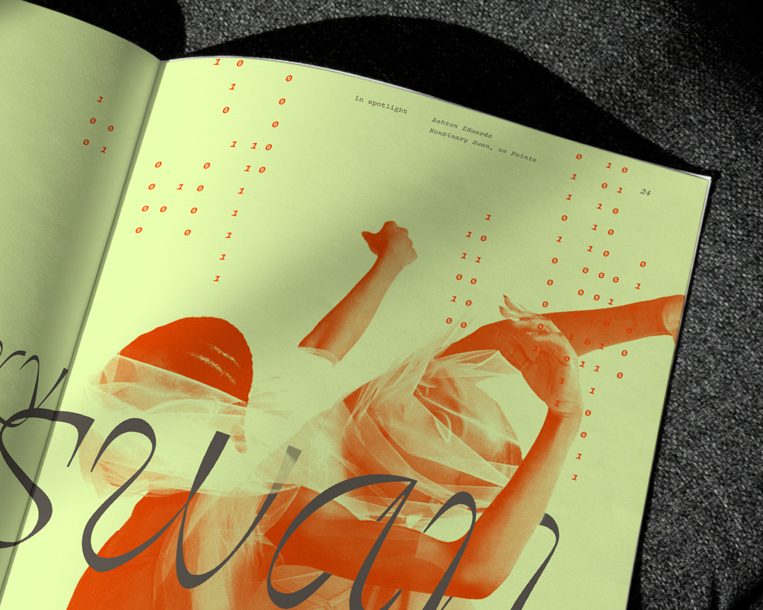

The page proportions are wider than normal to mirror the wide proportions of a stage. A main typographic grid divides each page into six columns, plus a secondary grid dividing each of these columns in half. This provides flexibility in creating various modular column widths that create a sense of "pushing" and "shoving."
Compositions break the grid as they dance across the entire spread, rather than being limited to each page, creating movement across the “stage.” Callouts use a variety of typesize and texture for a sense of rhythm and freedom.
Tension is created through slightly overlapping, but still legible, type and a contrasting color is introduced into one small element, such as punctuation, for rebelliousness.

Feature articles


The theme of dancing type continues in both articles' opening spreads. The feature article spotlights Ashton Edwards, a nonbinary dancer with a prestigious ballet company. Ballet as an artform is extremely reliant upon the gender binary, and Edwards is at the forefront of a generation challenging that.
The leading spread features binary 0's and 1's all around Edwards as they seem to physically break through the binary. Double-exposure-like images were created for this article to illustrate the conflict between Edwards' gender identity and ballet's strict gender binary.
The interview article highlights Yabin Wang, an award-winning dancer and choreographer who creates a one-of-a-kind fusion of Chinese traditional dance, ballet, and contemporary.
In “Drawing Pictures in Motion”, the motif of dancing bits of type is brought to the article deck as the type becomes the flower petals swirling around her as she dances in her traditional Chinese dance attire.

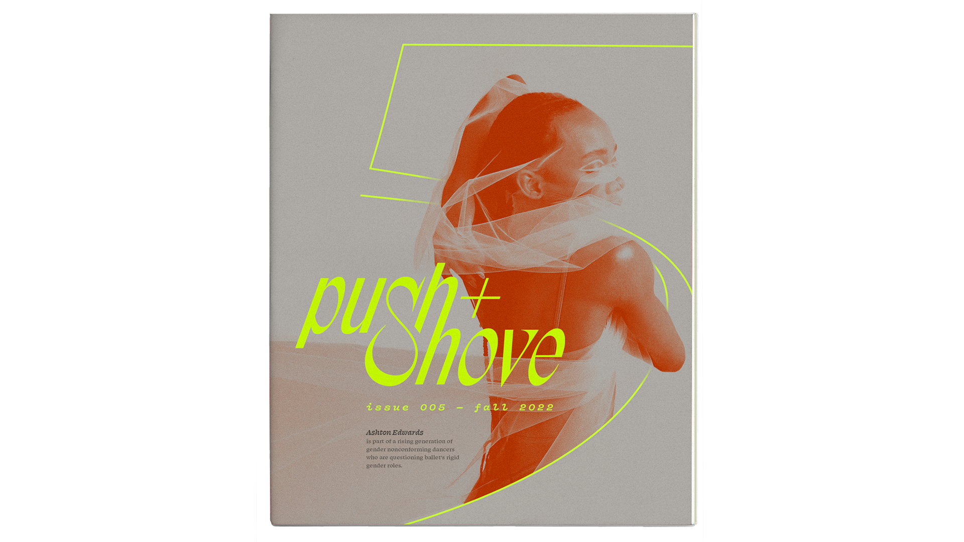
Playing with movement on the cover


The cover system includes a photo of the feature subject with the magazine issue number interacting for an enhanced sense of space, movement, and tension.
For this issue, an abstracted 5 wraps around Edwards, emphasizing their dancing while the wordmark "pushes" up against their back as if the catalyst of the movement.

Final Magazine

Sources


Original photographs by Coco Aramaki, Shi Chun Yang, and Wang Ning.

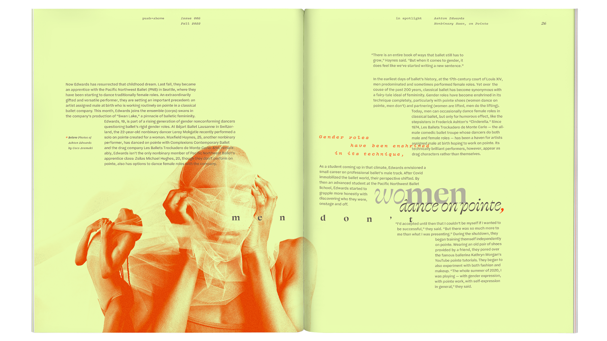
"Nonbinary Swan on Pointe" written by Margaret Fuhrer for The New York Times.

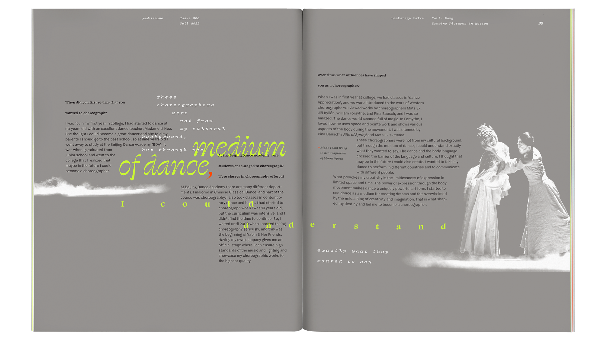
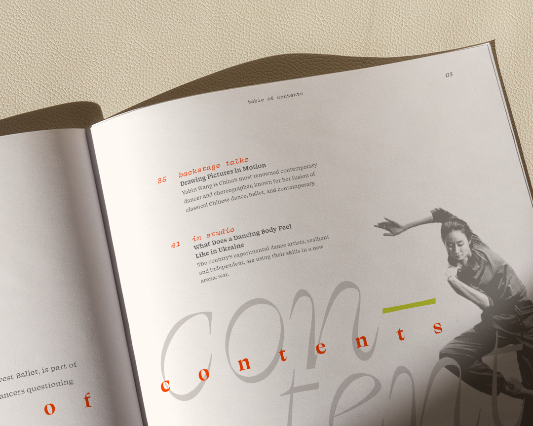
"Drawing Pictures in Motion" written by Maggie Foyer for Dance ICONS, Inc.

Featured dancers: Ashton Edwards and Yabin Wang.